
SENIOR PROJECTS, FALL 2022
DECEMBER 9 - DECEMBER 16, 2022
Opening Reception and Artists' Presentation
Thursday, December 8 • 5-7pm
At the end of their studies, art majors are required to develop and present a coherent body of self-generated work. This exhibition combines their knowledge of techniques and concepts while drawing on research of historical and contemporary artists. Each senior art major in the exhibition designs and creates a unique installation that combines their technical skills and conceptual vision.
Sponsored by The Layden Family Foundation and The Smith Family Foundation of Estero
Image: Al Payne, Conscious (Where We Meet) detail, 2022, Acrylic paint, pastel, mixed media, found objects.
-
Angela Arroyo OUTDOOR LIFE
Toggle More Info
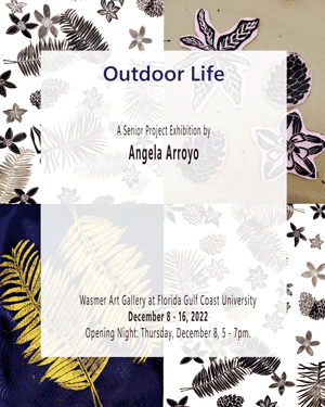
Outdoorsman is a term used to define a person who tends to spend a lot of time outside doing activities such as gardening, exercising, or simply reading a book. Studies have determined that people who are outdoorsman are people who tend to enjoy being around nature, extroverts, and are up to exploring new adventures. Exposed to the outdoors you see all sorts of elements nature has to offer from the fresh air to the botanical life. I characterize myself as an outdoorsman (or outdoorswoman) due to the lifestyle I have grown too since childhood. For as long as I can remember, my parents and I were always doing outside activities of all sorts: camping, gardening, playing basketball, and skiing. Now as a grown adult, I still aim to do more outdoor activities for leisure and wellness purposes such as going to the beach, running miles, and even going to outdoor night clubs to dance. Sometimes I just like to go outside to see the botanical elements around me. The plants that bloom exquisite flowers and palm fronds swaying back and forth through the wind become a source of cleansing.
My project Outdoor Life consists of a series of relief linocut block print panels of different botanical elements I have encountered in the two states I have lived in: Colorado and Florida. To make the symbolism stronger, I made linocuts for each of the two state flower: the columbine for Colorado and orange blossom for Florida. I chose to make my prints in black ink on white paper as studies of what each plant and flower looks like shape wise. I decided to use large sized paper so I could have the freedom to print in many areas to make a collage effect producing a wallpaper design. To create a sense of depth I used a printing ink transparency that lightens the ink to print in the various values of black and gray so that the print designs can overlap one another and still provide the detail of each floral. The linocut blocks were printed incoherently to generate a spontaneous epiphany of hurricane debris blowing everywhere, an experience I witnessed with Hurricane Ian. For more experimentation, I also made prints in color on fabric pieces to have an idea of what they would look like. The printing ink was chosen based on the contracting value it provided with the different colored fabric. With these fabric prints I proceeded to sew them together to make a quilt and a table runner.
Colorado and Florida have opposite climatic environments, but the different plants and flowers are what make each state unique. Generally, I always find outdoor adventures to explore because I enjoy watching the botany that is around any place I go. The different color tones, shapes, and smells of all the plants and flowers build such an intimate moment the details are so small you really must look close into them. Growing up in the outdoors has even influenced my style in clothing, as I lean more into buying dresses and shirts with floral patterns. Whether I am outside gardening, hiking, or drawing the outdoors provide a cleansing relief for my general health.
-
Christopher Bicknese THE GREATEST GIFT
Toggle More Info
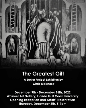
From an early age, I always wanted to make video games. As time went on, game development has become more accessible to the point that anyone can do it as long they put in the effort. Over the course of more than six years, I have continuously worked to make my dream a reality by developing a game, and my senior project is a map of that game world. The game that I am developing falls under the metroidvania genre, which describes two-dimensional video games with interconnected, labyrinthian level design with an emphasis on non-linear exploration. With this map, I want viewers to be able to experience a similar feeling of exploration and get lost in this world of horrors that I have created. The map is of a vast Gothic cathedral, once inhabited by a religious organization. The organization experimented with the creation of different lifeforms. A plague broke out from those experiments, dooming the organization to extinction. With their remaining time on Earth, they wanted to leave their mark on the world by creating a variety of monsters with the goal of creating their god in a physical, tangible form. They referred to this potential god as “humanity’s greatest gift”. The monsters were implanted with a guide inside them that would force them to continue their masters’ plan of creating god even after their masters are wiped out by the plague. They were bound by the adage “once God is created, humanity must be destroyed, for humanity will seek to destroy God”. These monsters ravaged the world, forcing what little was left of humanity to retreat behind the repellant areas of the cathedral from which the monsters spawned. There, humanity had no choice but to fight to preserve their existence, or find meaning in extinction.
As a fan of darker stories, I find motivation in trying to make a story and world with the clear goal of making it as dark as possible. I also enjoy getting to tie in my inspiration from video games to this project, of which Castlevania, Bloodborne, and Dark Souls are most inspirational to me. I’ve been working on this game for a long time, and in that time, I have faced some difficult times. My father passed away in 2014 and my mother passed away in 2017, and creating this game has offered me an escape outlet and something that I know I can fully control. I wanted to base my senior project on this game because I dedicated a significant part of my life to it, and this is the best way that I can show my passion.
I was excited to work on this project because I had never made a piece on such a large scale, nor had I ever spent as much time on a single piece. This is not an exact replica of the world found in the game. Rather, it is a simplified version that shows the general layout by including the most significant locations. By doing it this way, I can keep things visually interesting throughout the entire map and without too much repetition. It was very important to me that all of the rooms were connected in some way, such as by ladders or towers, so that the viewer can travel from room to room as if it were a maze.
I chose to use charcoal and graphite as my primary materials because I like the rich darkness of the black. The charcoal conveys a dark, harrowing atmosphere that I find suitable for this project. Graphite was used to make it easier to work with tight details. Throughout the piece, visual hierarchy is used to place emphasis on the most significant creatures and locations by making those parts larger.
-
Kaia Hein CHANGING TIDES
Toggle More Info
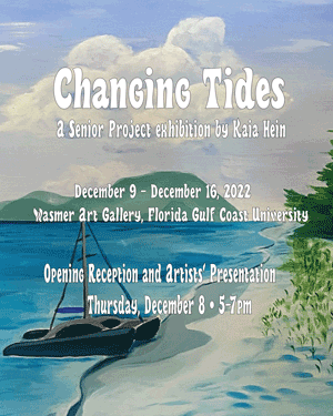
The idea that I chose to embody in this work was to create paintings of places that since childhood I have gone to escape the real world and be able to clear my mind. All the places that I have chosen to paint have water in them, water to me symbolizes change. It changes in density, salinity, moves in streams, can go from wild and wavy to calm and flat in a short amount of time. To further convey the idea of a change happening, I painted the landscapes in a monochromatic color scheme that I felt best represented me at the time. The inclusion of man-made objects in the landscapes shows the harmonious relationship between humans and nature without including actual humans in the scenes. From the first two paintings in pink to the last at the bottom in blue is how I intend to tell the story. I used specific colors instead of representing the scenes with the colors of how they would be seen in the natural world to show at what point in my life the place was from. The way I displayed my paintings are in the shape of a heart since all these places are near and dear to my heart.
The main reason I decided to paint landscapes of these specific places is because they are what brings me peace and comfort. Last spring, I was suddenly and unexpectedly affected with an autoimmune disease. It took a few months to get under control, but one of the last things my doctor said was to stay stress free, hence I got my idea to paint these specific places. The top two paintings using various shades of light pink, going down to the middle two being mostly lavenders and purples, then to the final painting being in mostly blues. The pink paintings would show two landscapes from my younger years of Miami and California. The lavender paintings are from my adolescence and teen years in Fort Lauderdale and Sanibel, I chose those colors since they were my favorite colors at the time. For the last painting in blue, it has always been one of my favorite colors and I felt since the landscape is of the island St. Kitts, a place I have visited a few times throughout my whole life, I felt that color was fitting. Since I have lived on both sides of the country and of Florida, I wanted to display that as well in my heart. The left side being the West coast and right being the East Coast.
Over the years I have worked with many different mediums, but acrylic paint has always been my favorite medium. Like water, it can be thin for light washes of color, it can be made thick to create relief, and used as it comes out of the tube with an opaque finish. The reason I used canvases of the same size is to show uniformity even though they are of completely different places. The canvases are all 24” by 24” because I wanted to challenge myself by going bigger since I have always felt more comfortable with smaller scale work. The images that I worked from to create all five paintings all come from photos I either my mom or myself took.
-
Claire Jenkins TO KNOW LOVE
Toggle More Info
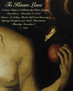
Love for some is exhilarating, desirable, and exciting, for others it is terrifying, intimidating, and difficult. Through the act of love, we are able to share ourselves with another person in the hopes that love can be reciprocated between the other. We begin to understand one another’s feelings. Through love, we give and receive emotional parts of each other that may be vulnerable at times, in order to know more about what the meaning of love truly is. I seek to find the meaning and purpose of our relationships with love. What is love? How do we know when we truly love someone? Why can our feelings and emotions be hard to communicate? Why does one love more than another? Why do we make ourselves vulnerable for love? What do we truly know about love until we experience it? Is everyone’s concept of love different? We meet many different people throughout life, and each one of us feel emotions in different ways. Throughout this journey to know love, we are faced with emotions that may be hard to comprehend. With each new person, we are able to see how truly different the definition of “love” is for every one, while also learning how to understand each other’s feelings.
My pieces represent a journey to know and understand raw human emotions. By displaying the human form in different positions, I am able to convey emotion. I am able to capture human emotion through body movement throughout my pieces. I strive to capture an emotion by displaying a single moment of interaction between two people. As a creator, I am relying on the lived experiences of viewers. My art communicates growth within oneself. When I start a sculptural piece I have a vision in mind. My final piece never looks exactly like the initial vision. This is similar to the concept of emotional growth throughout my pieces. Throughout our lives we are growing mentally, emotionally, and spiritually with each new experience. And just as my initial vision for a piece is never the same as the final product, emotions can develop in the same way. As emotions are recognized and we get to know them, we are able to form a better understanding of why we are feeling a certain emotion.
My pieces are created through a step-by-step body casting process. I schedule sessions with volunteer models in order to cast their figure into plaster. The models are coated with petroleum jelly before the casting process begins. Specific parts of the body go through the first step of body casting, which is the application of plaster bandages. Once the bandages harden on the body, they are removed and put back together accordingly without the model. The connected plaster bandages are then filled with spray foam. The exterior of the sculptures are plaster, while the interior is foam. An extra layer of plaster is added and sanded for finishing. My pieces are attached to plywood or canvas, and joint compound is added to the background after the pieces are attached.
-
Shelby Johnson A SIMPLE TOUCH
Toggle More Info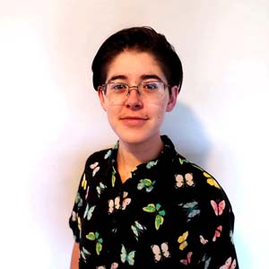
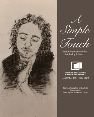
Hands are something that have always fascinated me as a subject but scared me as an artist. The intricacy of joints and motion make them difficult to draw or paint, but it’s their intimacy and function that draws me towards them. To me, hands are a gateway to the world around us that have a lot of potential in them. They are a tool that we use every day to text, write, hold, type, move, etc. but they are also used for active communication and socializing with others.
When I selected my imagery for this exhibition, I wanted to emphasize the potential and significance of the moment before an event happened; whether it was a simple act like picking up a cup, or a more meaningful one like a pinky promise. An action can certainly can be as simple as picking up a cup of coffee or tea in the morning, but it can also be the highlight of that person’s day and just what they needed to get their day rolling. The idea of a viewer waiting for this event to happen without being able to do anything to push it forward or even stop it was inspired by the impact of hurricane Ian. The helplessness of waiting for the hurricane to hit and the suspense of the results is something I wanted to capture here. While the interactions I chose were not as destructive, it is still impossible to know what will happen once contact is made. The cup of tea could be hot and burn the person touching it and a promise can be broken. I left it up to the viewer to decide based on their own experiences.
For this exhibition, I used pastel and charcoal on a base of hardboard. I cut the pieces of hardboard into eight 1’ x 1’ panels, and four 1’ x 2’ panels. Each board was primed with a toned, light gray gesso and then painted over again with a toothy Golden Artist’s Colors pastel ground to give it a texture that would hold the charcoal and pastel dust. For the pastel images, I used nonrepresentational color to add a little fun and vibrancy into the work as a whole and coupled with the charcoal it can show that not every moment is black and white. On the back of each panel is a frame of 1”x2” plywood pieces that were glued an inch from the border. This frame acts as a mount to hang the pieces on the wall, a raised surface to give some dimension, and keeps the thin hardboard from warping..
-
Megan McCarthy BE (LOVED)
Toggle More Info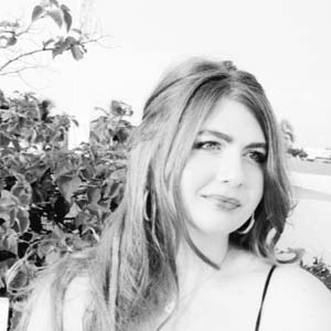
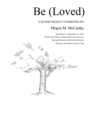
Time is the causation of change; they have an intrinsic synergy: time cannot exist without change. Life and the chronology of it, is a constant force of expansion and evolution. I want to capture the unfinishedness of myself and my personage, while also forcing a permanence onto something ephemeral. I have felt consumed in the art of losing myself to perpetual creation and rebirth; we are constantly moving forward, stuck in a linear track of evolution and invention. No one is ever finished; stagnancy is not a luxury allotted to life. Bonifying my ancestors and representing them with a stillness and finished-ness; grieving and appreciating the ending of who they once were in the moment captured that allowed them to be the people, they were to me—stuck in time.
The staircase in my childhood home was filled with pictures from floor to ceiling, of the people my mother held most dear. As I would ascend those stairs my eyes turned them into nothingness—they were background information I glazed over. But when I turned back and walked down them for the last time, I took in every photograph and every face. They were important to me again, like they always were to my mother who had carefully curated them and hammered every nail. As I moved forward through life, I had forgotten all the steps I took, as well as others, that have led me to my current personage and have allotted me my life. Now I have made my own wall of people, that I hold dear, to give permeance to those who have loved me into my own life. And to give a moment of solitude and remembrance to the steps they took that lead me to mine. My Grandparents walked, so my parents could run, so I can fly. My parents and grandparents, as sure as they were matured by time, were once people unknown to me and once so vulnerable and new to this world. My mother was just as much a little girl as I was, even though I will never know that version of her, only the little girl that she made me to be. And with lost life, changed love, and memories of the ghosts of my beloved lost to time, I give permanence to who they were in this world beyond what I have seen through drawing them for what they were rather than who they are to me. In my going forward, my achievements of goals, and the finishing of chapters of my life, I needed perspective, that of all the milestones that had to be met before mine were just as important. Life is like a tree; there was a seed, and a trunk, before the branches, and twigs, and the leaves that made me. And even though I may be just a leaf, I still am a tree.
To create my series of portraits, I collected vintage/antique photographs of my family members; the photographs chosen are integral, they tell a story of current personage and how my ancestors chose to represent themselves to the world at that time and reflect who they were to others. When I start the drawing process, I use a simple grid method, splitting their faces and mine into a three-by-three grid. I also find the exact middle of the face and my paper and make sure not to align them—I prefer the center of the face to be slightly off of the center (either being more right, left, up, or down from the true center of the page) this slight imperfection (in my opinion) gives the drawings a more humanist and approachable composition. Value is an important factor in my portraiture, I build it up in layers of Faber-Castell graphite and compressed charcoal slowly, blending between each layer on my Strathmore 400 series paper. I also use subtractive methods to bring out the highlights and continue building the form. I emphasize and complete what I have deemed relevant and important while leaving what I find to be unnecessary out; the face is something very sacred and pure, I let it stand alone because it already has so much to say. -
Samantha Rattner ARCHIVES OF THE CITY
Toggle More Info
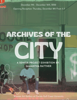
My exhibition “Archives of the City”, features the local charm of Southwest Florida as well as highlights the beauty and importance of the architecture through my use of detail, color, and perspective. With Southwest Florida being one the fastest growing regions nationwide, my digital artwork exhibits some of the important iconic and historical locations in Fort Myers and Naples. Portraying the beauty of the architecture of these cities, even in a non-traditional way, reflects my appreciation for it. Many of the places that I have featured have been gathering places for the community in Naples and Fort Myers for many years and contribute to bringing people together.
My interest in unique architecture stemmed from my love of drawing the complexities and nuances of these historical properties which have given me an increased respect for them. While our city will always be changing and evolving, these drawings capture it in its current state like an archive and may be able to be looked back on one day in memory. My process in creating these pieces was derived from my desired perfectionism. I questioned my own original style of art and strived to create something that pushed me away from what was comfortable. While I no longer sought perfection, I desired to explore a more creative outlet. To continue to explore this more creative style I decided to experiment with digital collage elements. This was achieved by using different color overlays emphasizing contrasting colors. This created spontaneity which juxtaposed the high details of the architecture.
For my project I used the iPad application, Procreate and drew with an Apple pencil on my iPad. I begin by scouting locations that are unique to Fort Myers and Naples and have importance in our community. By using photographs, I start planning out the shapes of the building and surrounding landscape, in an effort to digitally replicate the photo. Once my drawing accurately resembles the basic structure, I add small details, create overlays of different bold colors and other drawings, and experiment with the different layers. Procreate allows me to easily rearrange elements like a collage, (through the use of layers) and use trial and error more freely in my work. This is because I am able to easily undo my mistakes with just a two-finger tap.
-
Tiffany Shadden APOCALYPSE
Toggle More Info
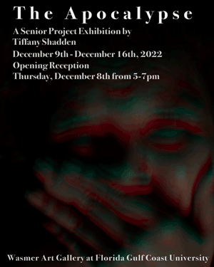
It is always said that the world will come to an end. Whether our apocalypse is tomorrow or in the next billion years, it will always strike fear into humanity. Through my life I have endured intense mental turmoil and I always wondered if there was a solution. When I discuss my episodes, they are in reference to surreal moments of panic, sadness, and anger. This can be partly accredited to my BPD (borderline personality disorder). During my journey, I experience intensive episodes that have greatly impacted the way I experience life. I am a whirlwind of emotions constantly erupting. I feel toxic, alone, and misunderstood by the people around me. When something changes abruptly or goes wrong, I get completely engulfed by feelings of doom. This stimulus sets off an explosion of emotional despair. This is when my own apocalypse begins.
I always wondered what was wrong with me and why I always reacted the way I did. I eventually sought out help, I began therapy. I was later diagnosed with borderline personality disorder (BPD), obsessive-compulsive disorder, bipolar II, and generalized anxiety disorder. Finally understanding there was a cause to all this “madness” was liberating but at the same time constraining. My mental illness doesn’t define me but it is a large part of who I am. Society shies away from the ugly emotions, they are often ignored. The project has allowed me to share my experiences as a digital, visual inventory. Not only do I hope that my exhibition brings awareness to these ignored moments but allows others to see that they’re not alone.
Through my exhibition, The Apocalypse, I was able to document my episodes in a controlled and safe environment. This series of photographs capture a visual representation of my symptoms. My technique revolves around long exposure photography along with lighting manipulation. My photographs show the passing of time, and this is achieved by using long exposure or slow shutter techniques. Instead of using a quick shutter speed, I use a longer one (normally around one second to two seconds). This effect creates a motion blur. To aid this effect I use strobing lights to create randomized colors, that emphasize and capture each movement I make. By using this technique, I will never truly know what the final photo will look like. Each photograph captures a moment where I was feeling anger, sadness, fear, and pain. My style of photography depicts true raw emotions that I experience in the moment. To take this stylistic approach, I created a mini photo studio in my house using black fabric as the background and constantly having my camera, a Nikon 6z, set up and ready. I never knew when an episode would come, so I always needed to be prepared.
-
Ben Schlessel AUTOMOBILE EVOLUTION
Toggle More Info
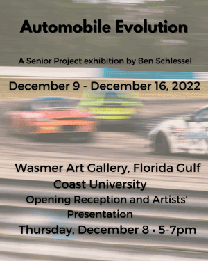
The intent of my project is to showcase the evolution of the automobile through a series of images that progress with speed and motion blur as the automobiles transition into modern vehicles. I also set out to showcase the performance and technology that the newer cars now have and did so by adding a lot of motion in the later photos. The first few images are of old cars- “classics”. These images are still and detailed shots demonstrating that not only were the cars themselves slower, but the technology they had (if any) is now antiquated. I mostly focused on exterior images of the vehicles as I believe that it translates the best. It is easy to tell whether or not a car is moving or still and I can also show off the chrome on the classics and aggressive aero on the newer ones. I made sure to include a detail image of the engine components of the classic cars to show off the patina and rust. In the newer cars I wanted to focus on the speed more.
I have always loved cars ever since I can remember. Every time I was in a car I would be looking for cool sports cars and big trucks. I started learning the names of brands and models and eventually got old enough to start going to car shows. As a beginning “photographer” I would use Kodak cameras (the ones you would have to get printed from the local pharmacy store) and eventually an iPad to take pictures when I was younger. In my college years I served as Vice President and President for the Car Club here at FGCU. This was a great way to network and meet students with similar interests in everything automotive. Only recently in the past couple of years have I acquired a Canon EOS 90D. It is a DSLR camera which is able to shoot 4K video as well. It has something I had always planned on and of course have fallen in love with capturing the perfect image.
I found out that going to a car show would be the most efficient way to capture the still images. As for the transition into rolling shots showcasing motion, I had to rely on connections to set up photoshoots in order to acquire the photos. As per the specific types of cars I chose to shoot, I wanted to focus on the years of the models rather than the brand or model. I started with classics going up to some of the most modern cars money can buy. My camera car was my friends Mustang for the majority of the images. I also used other friends to ride with in order to capture the moving images. The best time of day to shoot vehicles in is typically low light that is cloudy. This is mainly due to the fact that shadows play a big part in whether or not a photo looks good. Sunset time is also an interesting time to shoot in but can often be hard with judging the lighting as a result of the lack of sunlight.
-
Isabella Treece RECLAIMED
Toggle More Info
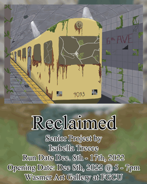
Through my experiences I have created images from my observation of nature. I created pieces of art from my experiences or things I find interesting that have been overrun by nature. In my eyes nature has overtaken what civilization has been left behind by humans as wonderful. The fact that nature has a way of persevering through any obstacle to continue growing is inspirational to me. I have observed nature growing in irregular places, for instance growing through or around cement, fences, and buildings. These drawings aren’t anything related to environmental awareness but rather they are how I view the world through my eyes when seeing nature doing what it does best.
I want to be able to show others what I see through my eyes whenever I look at nature and see it growing and the changes nature has on things like buildings, cars and everyday items. Whenever I see a tree growing around or through an object like bricks or fencing, I wonder how it was able to accomplish this. I know that everyone has different views and opinions of things like nature and the world around them so by allowing everyone to see the world how I see it will allow them to have a new perspective.
I started this exhibition by sketching ideas of environments I have experienced or would like to experience. I created 3 images with digital techniques and equipment. My sketches were created in Infinite Painter on my Galaxy Tab s7 as well as the initial painting for the Subway piece. I switched to using Clip Studio Paint on my laptop with my drawing tablet to redraw my first image of subway and its surroundings. I’m presenting my images by hanging them on a wall in a horizontal set up.
-
Nolan Tronnier COLORFUL CHAOS
Toggle More Info
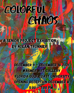
I chose to do my senior project on abstract expressionism because painting is the medium I feel the most comfortable with. Abstract expressionism is a form of painting that allows me to express my paintings in my own way. When I make my abstract paintings, I want the viewer to interpret the pieces however they want. The strength of abstract expressionism is that you express your feelings through art. While thinking about my senior project plans, and the type of work I wanted to produce, I had a tough time. Leading up to senior project, I was nervous but excited that I would be allowed to make pieces however I wanted to. I’ve had a lot of fun exploring different mediums and figuring out what fits me, and I always end up back with painting. I also researched other techniques and materials I could use, for example, matte board and foam core, which were much smoother to paint on than regular canvas.
I’ve always been interested in art from a very young age. Having a mom as an art teacher helped introduce me to famous artists, and I became intrigued and in love. When I’m painting, I lose track of time and can end up doing it for hours, and I must stop myself and take a break. It also gives me a sense of serenity and excitement before and after I complete a piece. Abstract expressionism is the term applied to new forms of abstract art developed by American painters such as Jackson Pollock, Mark Rothko, and Willem de Kooning in the 1940s and 1950s. I was interested in exploring gestural brushstrokes and mark-making and the impression of spontaneity.
While making my pieces, I did a lot of experimenting with color and which color works well with other colors and makes the piece pop. What attracts me the most about abstract expressionism is the use of color and how it draws you in. I want my pieces to have as much color as possible, so I only used bright colors such as yellow, orange, blue, purple, green, pink, teal, and red. I started experimenting with sponges, paint rollers, regular paint sponges, and spray bottles. I would also use loose, spontaneous brush strokes to give my pieces depth. For one of my pieces, I would even include metallic paint, high flow pouring paint, alcohol inks, and a painting knife for texture. I don’t have a massive studio like all other abstract expressionists, I did all my pieces at my kitchen table, but it’s a goal I would like to achieve. When I start painting, I lay a big towel down to protect my surface, lay my canvas down and get to work. I wanted to challenge myself for this project, so three pieces are 20 x 30 framed, the most extensive scale I’ve ever worked with. While creating pieces I thought maybe having only three big pieces would be to simple so I added four 8 x 10 pieces to go along with them. Although many artists I’ve researched started in oil paint and transitioned to acrylic paint, I worked mainly in acrylic because it feels the most comfortable. When asked if a painting is finished or how long it took, I never have an exact answer. There’s never a way to tell when my pieces are done until I’m satisfied. I always appreciate it when someone sees a painting I’ve made and compliments it. I like being able to come up with my own ideas and create what I feel like creating.
