Senior Projects, Spring 2021
Wasmer Art Gallery and ArtLab
April 16 - April 30, 2021
At the end of their studies, art majors are required to develop and present a coherent body of self-generated work. This exhibition combines their knowledge of techniques and concepts while drawing on research of historical and contemporary artists. Each senior art major in the exhibition designs and creates a unique installation that combines their technical skills and conceptual vision.
Sponsored by Alice and Dean Fjelstul, The Layden Family Foundation, The Smith Family Foundation of Estero and WGCU Public Media
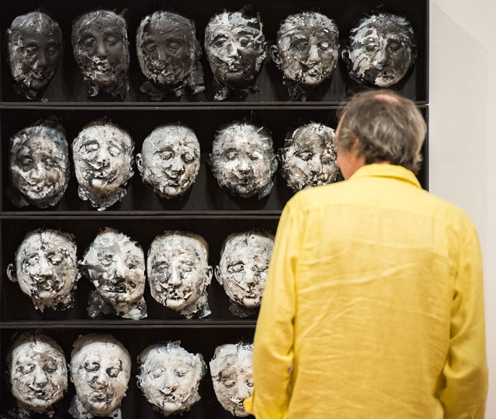
Image credit: Karri Leamon, Objectivity, 2018, Cast plaster, acrylic paint, and wood, photo by James Greco
The Spring 2021 Senior Projects provides proof that the students, staff and faculty of the Bower School of Music and the Arts continue to excel in spite of the challenges of this year. We are very proud of these fifteen graduates and take wonder in the breadth of their artistic achievements. Everyone on campus is encouraged to visit the exhibitions in the Wasmer Art Gallery, the Arts Complex Lobby and the ArtLab Gallery in the Library.
-
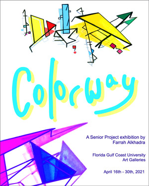
Farrah Alkhadra COLORWAY
Toggle More InfoWe exist within walls, surrounded by forms, and walking on planes. Planar analysis breaks down and simplifies the complexities of concept into flat planes of color. The underlying structure reveals itself, and the bones of the composition are displayed. Artists who use this technique often experiment with color and light to convey physical and emotional intentions. Painter Hans Hoffman believed that depth can be implied through contrasts of color, form, and texture, known as a “push and pull” within the work. Kinetic phenomena, such as implied movement and spatial movement, attracts the eye and commands attention from viewers.
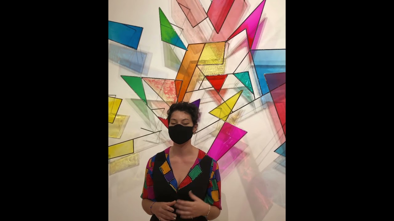
Inspired by a range of aesthetics, from the geometric patterns of Islamic art to the German Bauhaus movement, my sculptural installation is intended to echo these influences. I am interested in using materials in imaginative ways that require problem solving and reinvention. Here, I use steel and resin to construct a multicolored layering of parts. My intent is to form a complex body of overlaying planes that shift depending on what perspective it is viewed from. Using color, I am connecting to my personal history of artistic exposure. My palette is tied to my experiences in places that are significant to me, such as the United States and the Middle East. Rich indigos and cobalts are prevalent in architecture and art in places I lived abroad. From downtown Amman, Jordan, to coastal Famagusta, Cyprus, I awoke to blues and settled to evening oranges and red fire skies. Shades of pink, yellow, and green reference American culture and its influence on my upbringing.
Colorway was the result of experimentation with materials and techniques. The initial layout of the forms progressed from symmetrical and rigid to abstract and layered. I designed multiple individual components to be later combined into one dynamic yet unified installation, I created sketches that show cast shadows and light passing through color to visualize the planes. My final installation is partly based on my sketches; however, I let pieces move intuitively to preserve harmony and flow. Using hot rolled quarter inch steel, a bolt cutter, and grinding tools, each line was cut to size and joined through the semiautomatic welding process using a Miller MIG welding machine. To fill specific facets of each shape I used dyed resin, a silicone mat, and a torch for bubble reduction. After pouring each color into place and allowing it to cure, I trimmed the excess resin from the perimeters. The work was then lit from three different angles to create a spectacular display of cast shadows and color overlay.
-
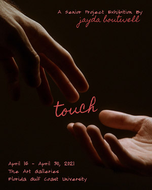
Jayda Boutwell TOUCH
Toggle More InfoTo seek and give care is one of the most powerful ways that we connect with each other, and touch is a major facilitator of that connection. Touch triggers the release of oxytocin, serotonin, dopamine, and endorphins. These neurotransmitters are known to have healing effects on the mind and body – they reduce blood pressure and anxiety, stabilize mood, control pain, and boost immune response. For infants, a caregiver’s touch is essential for the development of secure attachment and good health. It tells us that we are sheltered and secure, and that it’s safe for us to grow. It follows us to the end of life, a vital component of elder care and nursing for long hospital stays. Touch also facilitates empathy, as humans have a fascinating ability to discern a wide range of emotions through the sensation of touch alone; from love, gratitude, sympathy, and happiness to sadness, anger, fear, and disgust. In many ways, touch is a defining factor of our experience with living and bonding.
Touch deprivation is becoming a greater concern than ever as our world moves into the digital space. Amid the financial hardship, anxiety, anger and sadness brought on by the Covid-19 pandemic, the comfort of touch from those closest to us can be an anchor to hope. The significance of hands as a subject in my work stems not only from how important touch and intimacy is in my own life, but represents willpower and craftsmanship. Art has always been instinctual for me and my way of making that connection to my own humanity and sharing what I learn in the process. In a time of isolation, I want to create work that acknowledges the wounded, isolated ego and its innate need for empathetic connection. Through these drawings, my hope is that the viewer will recognize the universal human need for love, care, and understanding, and the extraordinary ability to provide connection through touch.
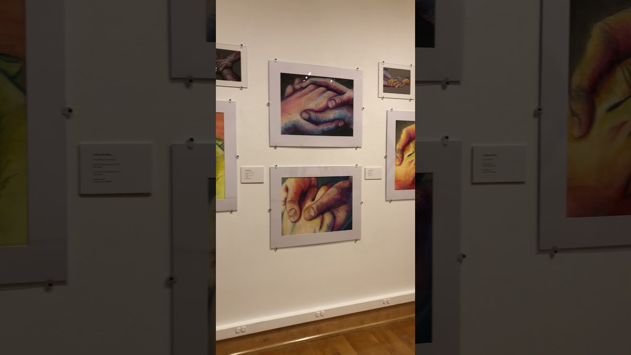
The color intensity and direct quality of both dry and oil pastels, blended by hand and through layering, became integral to this series of drawings. The subtle texture of a thick paper supported the sensory and tactile nature of the drawings, and a closely cropped image brings the viewer into an intimate space. Once these materials were selected, my process involved observation of body language focused on the hands, visualizing how the physical and emotional sensation of touch comes to the surface in our smallest gestures. To make this understanding clear in my compositions, I began working from images that I took myself with my partner, which allowed me to study these gestures from a personal perspective. Layers of dry pastels build up a landscape of color to capture the flow of emotional energy in the scene, and I then move into the denser oil pastels to build up the physicality of the hands. With this choice of materials the marks I make can be smooth and blended, mottled, or scattered, capturing the physical energy of the scene. The result of working back and forth between the two types of pastels brings multiple dimensions to each drawing to evoke the sensation and affectivity of touch.
-
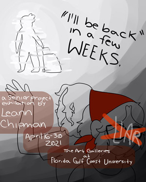
Leann Chipman I'LL BE BACK IN A FEW WEEKS
Toggle More InfoIn March of 2012 my biological mother told me that she was leaving for a short vacation, and that she would be back in a few weeks. I have not seen her since. Humans are social animals, and physical human interactions are crucial for our survival. Without it, we are at our most vulnerable. One of the most crucial building blocks for the future of our sanity is in our first relationship with our parents. If this bond becomes severed, it can have lasting impacts on someone’s life. It is amazing how our own minds can morph into our deadliest threat if given the right circumstances.
I have always been described as a sensitive child, so following this act of abandonment, years of “negative” emotions were allowed to fester. In order to protect myself from my own feelings, I became detached from my surroundings, which eventually led to my inability to trust others. While I am receiving help now that I am an adult, I still have been unable to get a clear diagnosis which leaves me overanalyzing and criticizing myself daily as to what is wrong with me. I am using this project as a way to embrace the negative symptoms I may have alongside the positive aspects of my life. My series details my mental struggle dealing with reliving my trauma and the daily battle of my unidentifiable emotions in an effort to face these issues head on instead of keeping them bottled up any longer. I have always been a tactile and visual learner, and the traditional mediums I use before digitizing these illustrations allow me to express the raw emotions I have a hard time articulating properly. My feelings are almost always impossible to describe accurately and typography has been helpful in demonstrating the constant overflow of racing thoughts I experience. After over two decades of keeping quiet about my struggles, I am exhausted. Pouring these emotions into my art has helped me decipher what I am feeling and notice patterns. This is my first step towards healing.
For my project, I focused on a series of 11” x 17” framed digital prints. Each piece I created began its journey through traditional mediums of watercolor and ink pen where I focused on the composition and narrative. Once I was satisfied with the layout, I uploaded the image of my traditional sketch onto my laptop where I then used digital illustration software to develop my line art and finalize the coloring. The digital platform is where I was able to emphasize the backbone of the project, the typography. In order to address the highly personal content in this project I created a new typeface based on my own handwriting.
-
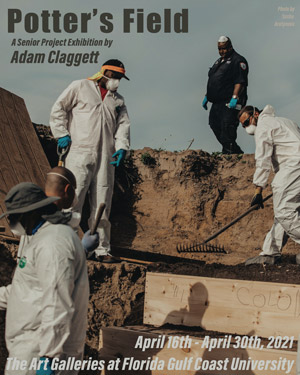
Adam Claggett POTTER'S FIELD
Toggle More InfoThe phrase “potter’s field” refers to an area of land set aside for the burials of indigent people and unidentified bodies. The potter’s field for the city of New York, Hart Island, is an abandoned, dilapidated island with no electricity located off the coast of Manhattan. It is operated by the city with the sole purpose of burying the bodies of people who could not afford private funeral services or whose bodies went unclaimed. It is estimated that there are over 1 million people buried on the island in plotted sections of mass graves each containing 150 plain pine coffins. While Hart Island is the largest tax-funded cemetery in the world, these burials are still conducted by inmates of a local prison, who work for between 50 cents and 6 dollars an hour. A deeper look into the history of Hart Island shows that before it was designated as a potter’s field, it had other purposes that were kept out of the public eye, such as a rehabilitation center, an asylum, a homeless shelter, and a camp for prisoners of war. The island has served as the burial site for victims of many epidemics and viral diseases, including tuberculosis, yellow fever, the AIDS and crack epidemics of the 1980s and 1990s, and most recently, COVID-19. The statistics of victims buried on the island show that these viral and social epidemics have disproportionally affected people of color, the LGBTQ+ community, women, immigrants, and those experiencing poverty and homelessness.
With this senior project, I work to unpack and cope with the inequalities within our country by taking the time to create artworks meant to inspire thought and communication amongst a broader audience. My work attempts to question the barriers of purpose, as an object’s function could be relatively successful to different audiences. Function and purpose could be defined as daily use or simply as a chance at a meaningful conversation to show that we’re more alike than we are different. I gain closure and a brief moment of power by being able to comment on the world around me, as my views and opinions evolve along with the many stages of making, firing, and decorating ceramic forms. I’ve begun to understand my relationship with clay as a mirror for the relationship I have with myself. I work with clay and vice versa; we take time apart to mature, gain stability, and blow off steam. We work with and against each other in multiple stages until we both agree that the mission of our personified relationship is complete.
For this project, I have created 75 functional jars, intimately suggestive of cinerary urns of different sizes. Each jar is representative of two people, totaling the 150 people buried in a single grave on Hart Island. These jars are made using different clays and surface strategies, suggestive of a diverse and complex community of identities on the island. The jars are decorated with colorful backgrounds and collaged with expressive drawings meant to align with the urban art culture of inner-city New York. They’re also plastered with decals of newspaper clippings, ranging in topics from death statistics to quarantine trends, to remind us of the overload of information that many of us were hesitant to give attention to over the past year. This layered collage reflects the burden of news and information that we have become desensitized to in order to distract from the issues plaguing the world around us.
-
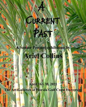
Ariel Collins A CURRENT PAST
Toggle More InfoHistory repeats itself, and some things never change. Recurring characteristics and activities in Afro-Caribbean and African American society align with studies of cultural parallelism in anthropology. Cultural parallelism is the development of similar social trends in geographically distinct groups that have never corresponded with or contacted one another. Some clear similarities in the past and present of black culture are methods of styling and protecting hair, tastes and passion in the preparation of food, and production and perceptions of music and dance. The ancestors of African American and Afro-Caribbean people used braiding hair as a form of intimacy to communicate safety. They used headwraps to preserve their hairstyles and protect their hair from harsh elements. Food was essential for survival and comfort in the new world during slavery. Music and dance were forms of shared communication seeking freedom, ease, and strength.
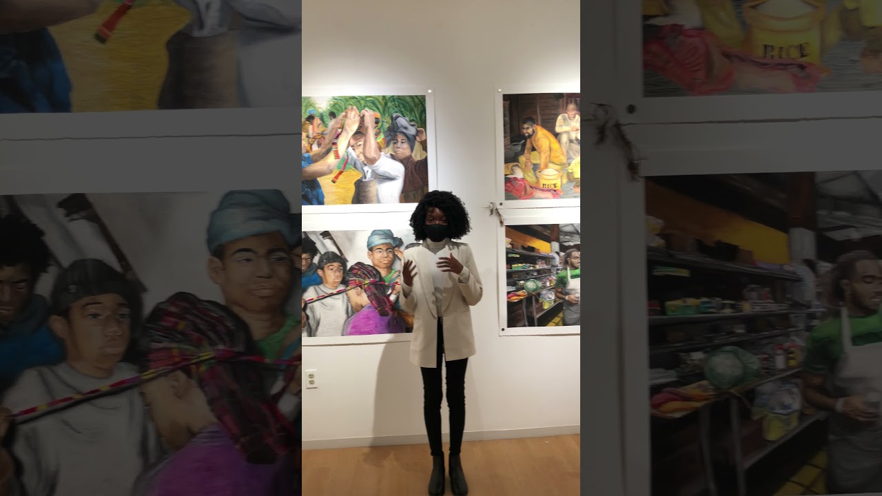
When I came to college, I was made more aware of my race because I was often the only black student in my classes. Having been raised in Miami, I am used to diversity and to conversations that pertain to race. In my college classes, race was made out to be both political and trivial. It made me uncomfortable to modify how I talked in class, and I noticed other black students shared the same feelings. In response, I began making art that expressed the things I could not talk about in class. To expand my knowledge I also began studying my personal lineage and topics about black culture. When I studied cultural parallelism I noticed how black culture has remained the same. Through these studies I could see how similar my Afro-Caribbean and African American ancestors were. The drawings I have created for this project bring the past and the present together. They show the beauty of cultural adaptation and resilience in the face of adversity. These four sets of drawings and their mixed media attachments show how the inherited practices in hair braiding, headwraps, food, music and dance still have a meaningful role in our everyday lives.
The works in this exhibition are created with oil pastels, colored pencils, and linseed oil. I first made gestural marks with black, brown, or white in various areas with oil pastels. These colors serve as shadows and highlights that were later covered with vivid hues. After the layers of colors are scribbled onto the paper, I use Q-tips with linseed oil to blend them together evenly. To create finer details, I use soft colored pencils on top of the blended layers of oil pastel. The mixed media attachments consist of collard green and sweet potato roots, goatskin drum hides, kente/madras cloth, and kanekalon braiding hair (a modacrylic fiber that resembles the look and texture of human hair). Kente is a brightly colored fabric produced in Ghana. Historically, kente is worn by royals in the Ashanti and Ewe ethnic groups. Madras is a Caribbean fabric that consists of patterning with different colored stripes that cross each other to form uneven checks. I handstitched the kente and madras together, and I also handstitched the goatskin drum hides after stretching them. The collard green and sweet potato roots were dried, pressed, and bonded with glue.
-
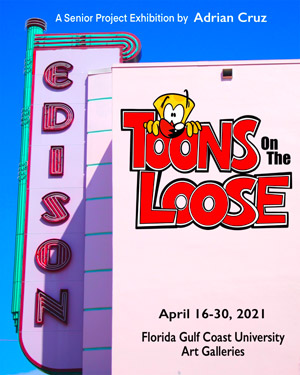
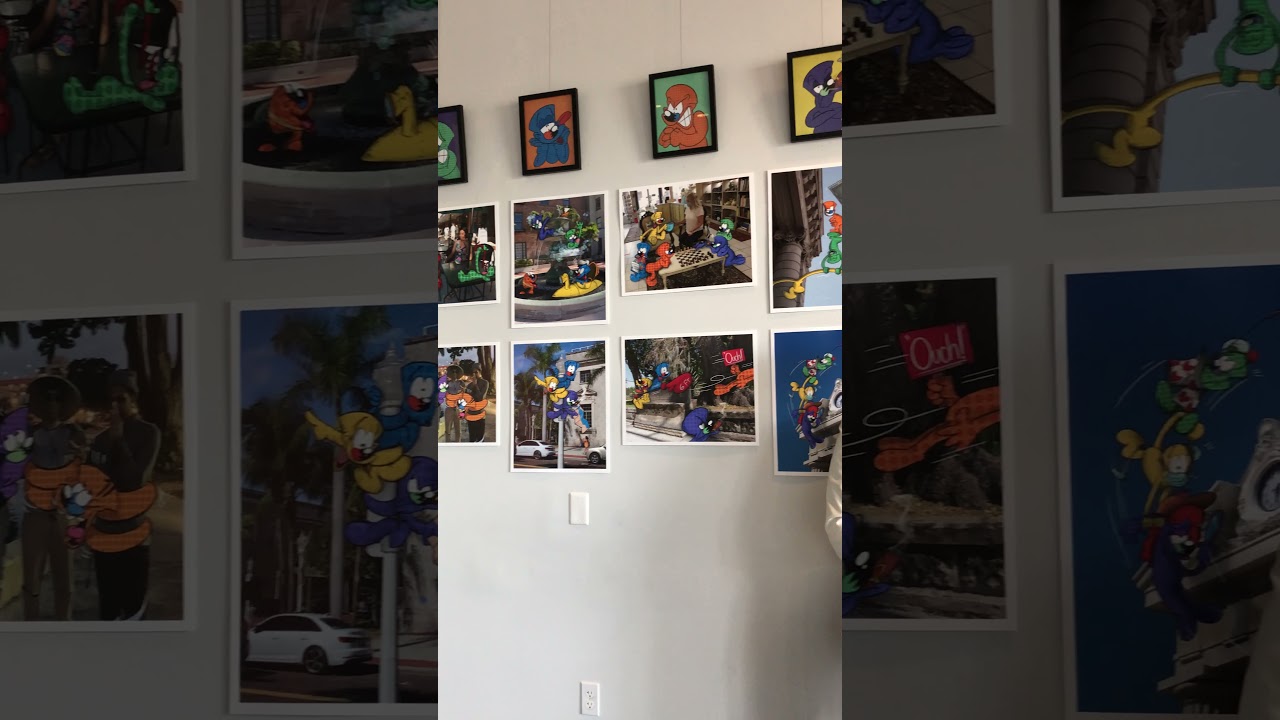
Adrian Cruz TOONS ON THE LOOSE
Toggle More InfoThe art of cartooning has been a source of hope and entertainment for audiences dating back to the era of the Great Depression. Cartoonists such as Walt Disney, Hugh Harman, and Max Fleischer have all contributed to entertaining the world through its darkest of times. In 1933, artist Walter Lantz and Bill Nolan created an Oswald the Lucky Rabbit cartoon titled “Confidence”. An animated short that reflects on the fear that covered America before President Roosevelt’s election, the film renewed the confidence felt by the American people after he was elected. In today's economic climate, a cartoon like this might be helpful to lift our nation's current mood and outlook during the pandemic. Just as Oswald spread confidence into American peoples’ lives, my group of cartoon characters will do just that for a new generation who are in need of hope and confidence in their daily life.
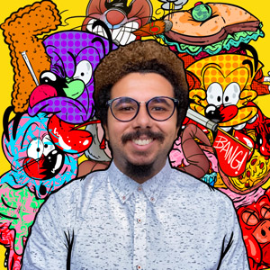
Affected emotionally by the friends and family lost to the coronavirus pandemic, I have tried to look for ways to escape the virus's power to destroy humanity. Drawing cartoons has helped me get through the day-to-day stress, struggles, and loss that this pandemic has brought not only to myself, but to the world. What about the people out there who don’t have the support to get them through these troubling times? Toons on the Loose is a project that primarily focuses on my hometown of Fort Myers, and the population of people who are struggling to emerge from the pandemic’s attacks on their businesses, personal lives and mental health. The characters in the series have a specific goal, and that is to spend time with the people in downtown Fort Myers and cheer them up. According to the people I’ve spoken to, time is the one thing they wished they had back, and the way that they would use that time is by spending it with their loved ones. Although we can’t turn back time, we most certainly can move forward with a more positive attitude towards the future created by Covid. In this series, that new attitude comes from the cartoon characters themselves, The Toons, who with their engaging personalities are spending time in town and amusing the people they meet.
Toons on the Loose is developed by using a technique of combining still cartoons with photographs, to create an image with both cartoon and person existing in the same space. This is done by Procreate, an app made for the iPad Pro that functions as a Photoshop tool and allows me to draw and edit on any image uploaded. This specific approach to the project was made so that the cartoon characters would appear to interact with real people in a real setting, and allow the human collaborators participating in the project a chance to use their imaginations. Working with local businesses - Scoops on First and Past to Present on Hendry Street - was a huge highlight of the making of this project because I wanted to share with my viewers the charm and delight that comes from these businesses.
-
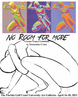
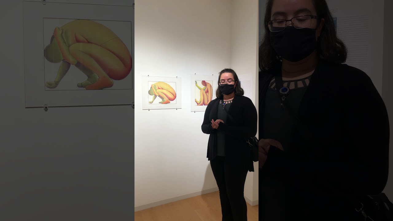
Yessenia Cruz NO ROOM FOR MORE
Toggle More InfoIn Nicaragua, machismo demands that Latin-American women follow what men say and should simply accept their role in society as housemakers. This idea affects families by grooming women to maintain the household while the men work. With a strong sense of masculine pride dominating the culture in Nicaragua, expectations were created in the family where the women are more restricted compared to the men. In a similar sense, as drawn by male artists the female nude is closely associated with sexuality. With a personal direction of depicting women’s positive attributes, women artists also draw the female nude, both in sexual and nonsexual association. They have been trying to reclaim women’s bodies through unique expressions of their own experiences and knowledge of being a woman.
The rise in women artists reclaiming the female nude inspired this project with a similar direction of portraying the body from a personal perspective. In this chaotic world of decision-making and struggles where I try to balance a social life with work and school as well as deal with the rise of COVID-19 concerns, I have always been cautious in the decisions and choices I make. I have lived with unfair cultural restrictions because of my gender, but I have outgrown the limits I grew up with. I find, however, that I have replaced them with new restrictions of my own that give me comfort. As a result, I have learned to make the best of any situation I’m placed in. In this project, I draw a representation of myself finding ways to fit into a series of restricted spaces. This becomes a way of coping, of drawing someone that I have control over - how they are posed, how they are formed with color and segments, and where they fit into the canvas. This state of mind is the central influence for the work I have created. Within this frame, there is only room for my body and my life, with all of the many issues I am trying to balance.
I begin with the creation of a composition on the iPad using a program called Procreate. First, I create a draft of each drawing with different layers and adjust the composition as needed as I rotate and alter the layers. After all the compositions are finalized, the digital line drawings are then exported as JPEG files, printed on copy paper, and transferred onto white Arches Rives BFK paper via carbon transfer paper. I create the space for the work by masking out the border, leaving an 11x14” window for the drawing. I then use Prismacolor NuPastels to add color and form to the line drawings, blending with mixed intensities of four colors: red, green, yellow, and purple. I leave the dust from the pastels on the paper for a light wash of color around the work when I remove the masking tape border. I finish with adding the matboard, where the darkened bevel will create a box around the work and further add to the sense of restriction around the cramped figure.
-
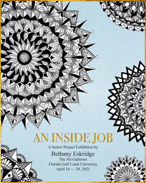
Bethany Eskridge AN INSIDE JOB
Toggle More Info“The quest for wholeness can never begin on the external level. It is always an inside job.”
– Dr. Shefali Tsabary, 2015.
Originating in the Tibetan Buddhist religion, sacred mandalas have been used to represent the universe as an encapsulation of the beginning and the end through a series of continuous circular patterns. The word mandala is Sanskrit for the word circle and the art form carries significance in many cultures around the world, especially in the Buddhist and Hindu religions. The present use of mandalas has expanded from religious practice to a form of secular visual expression. Carl Jung was the first psychologist to use mandalas in therapy because of the calming effects created when drawing them. This discovery has helped to treat anxiety, depression, and post traumatic stress disorder. In a society where mental illnesses like anxiety and depression are so prevalent, especially during the Coronavirus pandemic, it is essential for those who are suffering to have a creative outlet.
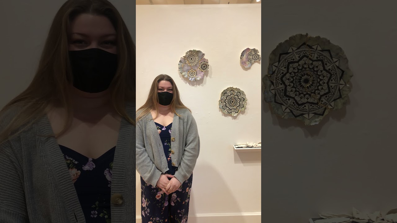
I struggle with anxiety and depression, and finding peace amongst my thoughts does not come easily. Mandalas have been a form of meditation for me for as long as I can remember. Over the course of the past year, my mental health took a turn for the worse, essentially leaving me in fragments. I tried different ways to put myself back together and cover up my brokenness but, unfortunately, my efforts made things worse and caused me to lose parts of myself that I can never recover. Today, I am on a journey towards healing, using clay as a canvas for my mandalas. I am no longer hiding my broken pieces and parts, but rather exposing them with one of the world’s most precious metals, gold. The use of gold in my work refers to the ancient Japanese art of Kintsugi, a method of repairing ceramics that emphasizes the damage rather than hiding it. This art form communicates the lesson that just because you are broken does not mean that you no longer have worth or that you cannot still be beautiful, but rather the opposite. It is because of our brokenness that we are now worth so much more.
The wall forms in this senior project were created using a low fire white clay body thrown on the potter’s wheel. Once the forms dried to a leather-hard state, the back of the platters were trimmed and the malleable rims were manipulated to create the delicate edge. When the plates were completely dry, I used my carving tools and various other methods to make cracks, and break off areas where needed. The pieces were fired at the bisque temperature of 1728º F, and then black underglaze was carefully drawn in to create the intricate mandala patterns. Clear glaze was applied and the forms were fired again to 1888º F. Finally, I added the colored china paints and gold luster to the cracks and the rim, and fired them for the last time to 1267º F.
-
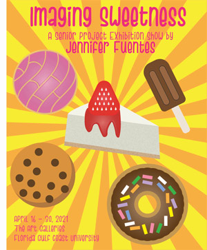
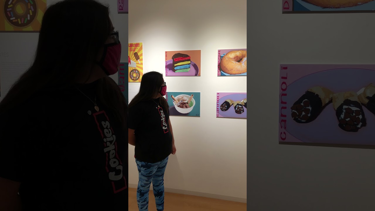
Jennifer Fuentes IMAGINING SWEETNESS
Toggle More InfoThere are people who have a very strong sweet tooth, and a powerful desire for sugary goodness. The term sweet tooth was used as early as the 1300s, as a form of idiom that expresses one’s love and fondness for desserts. There are many kinds of desserts that people enjoy eating like cakes, cookies, chocolate, doughnuts, and other types of pastries. While many desserts are delicious, they can be unhealthy for your body. The amount of sugar that consumers eat every day can lead to obesity, cavities, high blood pressure, and heart disease. Sometimes people wish to replace regular sugar with an alternative substance, like honey, monk fruit, maple syrup or coconut sugar, so they can control how much sugar they eat. Chocolate, which is the most popular dessert to consume, is also viewed as food art because of how confectioners’ design and decorate their chocolates. Desserts are more than just a type of food that we eat, however. They are a type of art that we see and feel. If a person were to take a bite of any piece of dessert and eat it slowly to savor its sweet flavor, they will experience the delicious taste and aroma that is sugar.
I chose to focus my senior project on dessert because of how much I love dessert. (Even though it can cause me to gain weight.) I find dessert baking to be culinary art, like how bakers can decorate cakes with a variety of different types of colored frostings, toppings, shapes, and patterns. My favorite type of desserts that I like the most are chocolate chip cookies, brownies, cannoli, and especially churro and concha because of my Mexican heritage. I also like cheesecake, which I will be having on my birthday. My experience with cooking and baking have developed into a hobby. It has also inspired me to one day open my own baking shop. However, the ingredients that I will be using in all my baking recipes will only consist of dairy-free butter, alternative sugar, and fat-free milk because to be honest, I do not want to cause my customers who come into my baking shop to gain weight. I just want them to feel good and healthy when they try my baked goods.
The media I have chosen for this project are graphic design and photography. The software that I use for my photographs is Adobe Bridge, and for my graphic designs I use Adobe Photoshop. First, I took ten photographic images of my favorite types of desserts. These chosen desserts are chocolate chip cookies, strawberry cheesecake, concha, churro, brownie, cannoli, doughnut, ice cream, cinnamon roll, and rainbow cake. The images were edited in order to make sure that each of the photographs are clean and sharp before processing them in Adobe Photoshop. The photographs were then turned into graphic images using digital painting techniques. The magic wand selects the pixels of any colored tone area and then the eyedropper selects the colored areas of the desserts so I can give them the right color or give them a different color. Then, I label the names of every dessert with typography and I add in my signature. In the final process of this project, the digital images will be transformed into postage stamp designs.
-
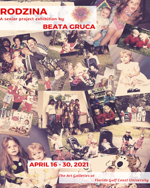
Beata Gruca RODZINA
Toggle More InfoThe word rodzina means family in Polish and in Poland, family is the core of daily life. The people in your family can help shape who you are and how you grow. However, each member is an individual with their own personality, experiences, and knowledge that can influence the family’s development, whether good or bad. Flowers are similar in this way, because they rely on outside sources to determine their survival, and depending on their surroundings, they can either thrive or wither away. I decided to use flowers to describe the two most prominent personality traits of each person in my family, because they have helped shape who I am today.
My father emigrated from Poland to the United States in the 1970s and eventually settled in Florida with my mother ten years later. My parents had a traditional upbringing in Poland, and my three siblings and I were raised the same way in the U.S. With the influence of both American and Polish cultures in my household, I have been given a rare opportunity to experience both. And since my family is constantly together we have been through a lot with each other and these experiences, good and bad, have shaped me in ways that I am continuing to discover every day. One notable experience was the property damage from Hurricane Irma, when my father and I, heartbroken, had to cut down what remained of the trees we played on as children. These tree stumps are the central feature of my Senior Project because they remind me of all six of us, myself and my family members. Using clay was the obvious choice in this project, due to the fact that it’s of the earth and it shares in this relationship with humans. These particular flowers were chosen carefully based on geographical area, with two selected for each person – one native to Florida and the other native to Poland. It shows not only the representation of traits, but also the blending of my heritage from past and present.
Each flower was hand sculpted using a white clay body called B-mix by Laguna Clays. Once the flowers were completely dry, they were bisqued to 1728°F. In order to capture the essence of the real flower, I used an array of underglazes and mixed them to match the original coloring. To create a distinction between the range of personality traits that the flowers represented, I painted some with clear glaze and fired them to 1888°F, but the others I decided to leave matte. The flowers were then attached to their specific tree stump either individually or by using clay slabs. Depending on the flower type, the larger ones were attached separately, while smaller ones were attached to a slab and then to the tree stump. Each stump is supported by a wooden base that is either covered in moss, left bare, or a combination.
-
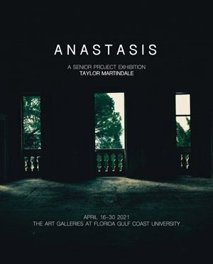
Taylor Martindale ANASTASIS
Toggle More InfoAmidst major industrial and technological revolutions, our society has become entranced by the lure of the future. This is not a recent venture - architectural movements like Art Deco, born out of the violent onslaught of World War I, sought to uphold this ideology of technological innovation and futurism rather than looking back on what was before. However, this transfixion is futile, as so many of our predecessors have learned before us. What people once saw as technological innovations now stand as abandoned buildings, forgotten and derelict. When we are all gone, this will be the fate of the things we leave behind. But hope is not lost. What humanity dominated will become filled with nature’s bounty of all kinds, whether it be plants or animals. Books such as The World Without Us by Alan Weisman exemplifies the fascination with this post-human world, where instead of noise pollution and bright lights there will be deep impenetrable foliage and birdsong. This is not a theory based on imaginative conjecture; abandoned buildings found today already show an increase in plant growth and habitat rejuvenation. An example of this is the Chernobyl Exclusion Zone, where many plants and animals have begun to thrive despite the irradiated environment.
Throughout my life, I have felt an undeniable pull to deserted buildings. Their emptiness is something that I often reflect within myself and my spirit. I notice my constant separation from other people, which has resulted in my feeling distant from even those with whom I should be closest. To me, this is like an abandoned building, which stands forgotten and separate from the bustle of people inhabiting it. My remedy for this has always been the beauty of the natural environment. I consider myself a Christian naturalist, which means I believe that God is within nature, therefore when I’m outdoors I am the closest to God. The connection between my beliefs and the natural world is what inspired the title of Anastasis. Meaning “resurrection” in Greek, this term refers to the Resurrection of Christ in Christian theology. I chose the name of my series Anastasis due to its connection with the revival of natural habitats after humanity is gone. When I spend time in natural environments, listening to rustling leaves or walking along an empty beach, I find myself rejuvenated from the exhaustive energies of modern life. One of the ways that I express this is through art. Even as a child, features of nature like animals and plants were a constant theme in everything I created, whether it be through drawings or paintings. Once I’d entered college, most of my work has been based around the natural world. As someone who is spiritually healed by being outdoors, I can’t help but depict it in what I make.
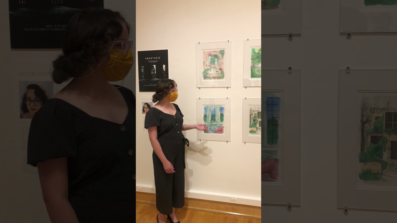
My reason for using watercolor as the medium for my Senior Project is because it is the medium that I wish to develop for my future career in illustration after graduation. One of the struggles that I came across when using watercolor was the challenge of depicting depth. Watercolor is translucent, and although it is easy to layer, sometimes it was hard for me to do so without the picture becoming muddy. That’s why I started using deeper blue greens for darker values and yellow greens for lighter values. In order to better define the edges of the subjects in my pieces, I’ve found that black ink pen provides a lot of depth and contrast. This project allowed me to extend my skills in watercolor painting through an extensive process of studies. I looked at details of nature and landscapes, as well as Art Deco buildings in order to become better acquainted with the subject matter of this project. As I’ve developed these images, I have realized a connection between the immediacy of watercolor paint and the unstoppable forces of the natural world.
-
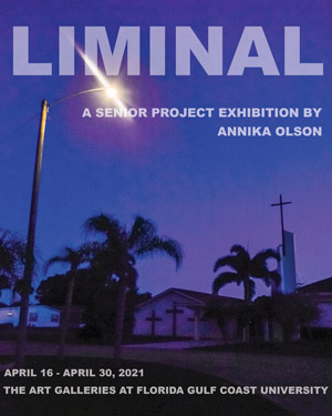
Annika Olson LIMINAL
Toggle More InfoLiminal spaces are transitional areas, in-between spaces where you are not intended to stay for long. The word liminal comes from the latin root limen which means threshold. Thresholds are edges separating two areas, between one state and another. Liminal spaces bring about opportunities for change and are not just limited to physical environments but can also refer to states of mind. I am interested in these transitional areas and the feelings that arise in them. Examples of physical liminal spaces would be empty parking lots, abandoned buildings, airport lobbies, waiting rooms, rest stops, empty hallways, etc. These are places that when stayed in for too long, reality feels altered.
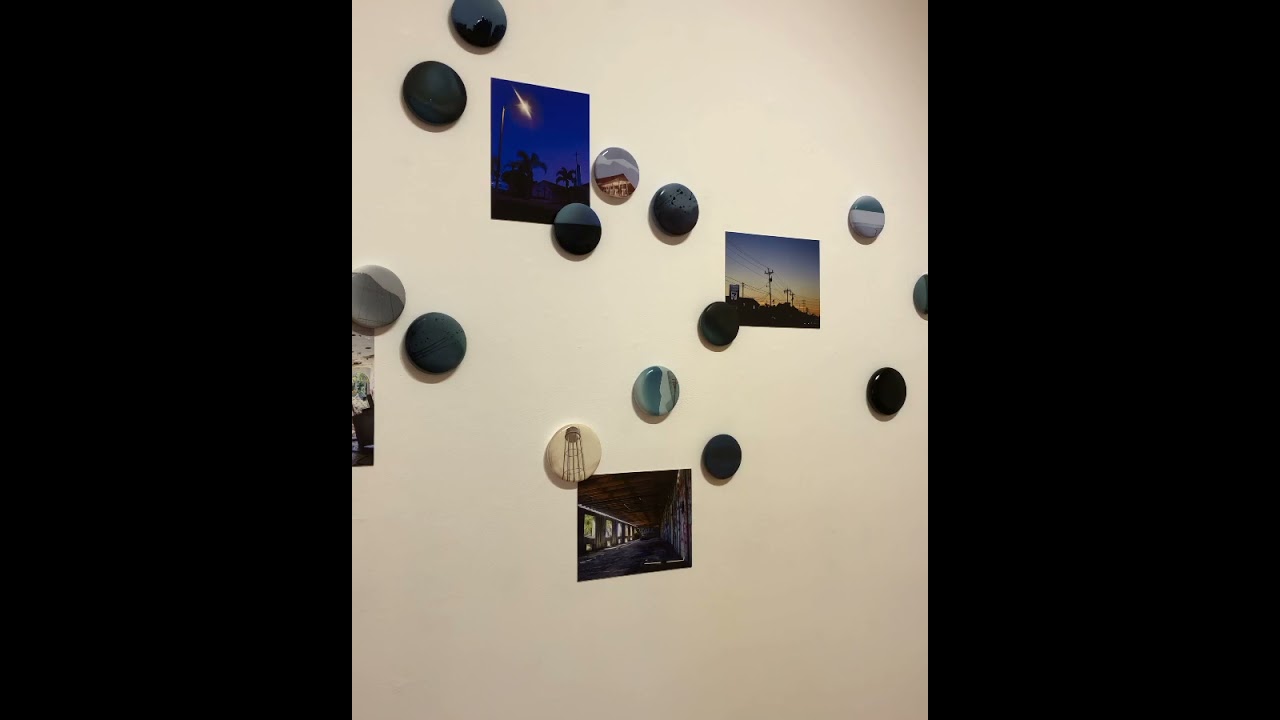
I have always found myself drawn to liminal spaces. As long as I can remember I’ve loved airports- the airport is a classic transitional space, you really only go there to get to somewhere else. Before a flight, I arrive at least a few hours earlier than I have to just because I like the airport as its own setting. For my senior project I created a mood piece exploring liminality and its accompanying headspace. I chose to use photography because of the opportunity for preservation in fleeting moments, and the way you can use lighting and editing to alter realities. I am fascinated by ceramics because once you fire something it is durable and it is an object that isn’t going anywhere. By using these two mediums together and binding the photos to the clay in the firing process I want to juxtapose the transience of the photograph with the permanence of the fired clay.
For this project I chose to combine photographic images and ceramics to create an installation with multiple elements. I used a low fire white earthenware clay to make circular, wheel thrown forms. These forms were treated with a layered surface including underglaze, custom image transfers, glaze, and laser decals. I took my own digital photographs of liminal spaces and sent them out to be made into transfers, and then used these transfers on the clay. I also used laser decals from photos I took and layered that on the surface to give it depth.
-
Rachel Peek TRYPOPHOBIC OVERLOAD
Toggle More InfoPhobias deal with irrational fears within oneself and can be anything from the fear of spiders to the fear of the color yellow. Some seem more “reasonable” than others, but at their core, phobias give the victim an irrational response that inevitably impact daily life. Trypophobia is defined as the fear of clusters of holes or bumps, and studies documenting this response date back to 2013. It is a common notion that the reaction is more disgust than an actual fear but can still cause panic attacks and other serious reactions. The fear is commonly associated with natural objects like lotus pods and honeycomb, patterns like polka dots, and skin diseases like eczema. As a result, people with this fear can be surrounded by triggers in their everyday environment.
Trypophobia has been a part of my daily life for as long as I can remember. When I was young, I used to have thoughts like “that honeycomb is gross” which resulted in a fear of bees. I also have had sensitive skin my whole life and I get hives when I am nervous or having an allergic reaction, which has led me to a fear of my own skin. To me, there was no escape from this syndrome that no one seemed to understand, especially when my own skin could trigger me. When trypophobia was finally given a label as a disorder in 2013, it validated my emotions and feelings; because it was something that other people were also experiencing. I myself do not understand these feelings or fears, but I wish to learn. For my senior project, I wanted to portray my fear and how I experience it in my daily life.
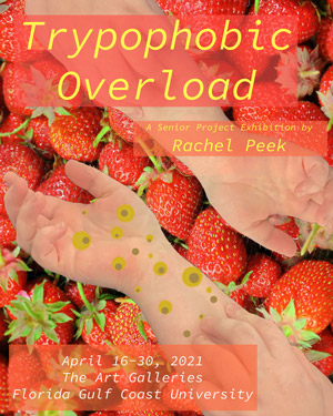
After delving into research of the phobia and how others are also triggered by it, one of the most effective ways of showing it is through a sense of overload. By using a collage technique mixed with painting and hot glue for texture, I can effectively show my fear in an aesthetic way so people can begin to grasp the feelings and fears I deal with on a daily basis. By using thicker panels and continuing the motif on the sides, the viewers can never have a break from the trypophobic imagery. I also use texture to generate a textile response in addition to triggering images. This way, they are overloaded with images that trigger sight and touch. They may not have the rare fear, but they can still get a sense of uneasiness from the disembodied hands and other body parts and cluster of patterns and textures. With this, they can see the world as I do.
-
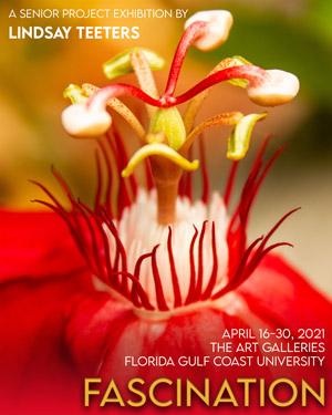
Lindsay Teeters FASCINATION
Toggle More InfoFrom the seductively lush paintings of Rachel Ruysch in the 17th and 18th century to the eroticism of Robert Mapplethorpe’s photographs of flowers from the 20th century, we have long been fascinated with the beauty of flowers. Our love and attraction to flowers over time is undeniable, but why are we so infatuated with the rich colors and intricate designs of these beauties? It may be the way the colors blend seamlessly, how the floral form can contain both passive and aggressive shapes, or it is even possible that the allure of the flower strikes us on a Freudian level. Anatomically, flowers, fruits, seeds, and pollination are all part of the reproductive elements of a plant. So it is not surprising that flowers are often subliminally associated with romance and sexuality. In the same sense, humans use similar tactics as the flower in order to attract attention to themselves. This exhibition delves deeper into the relationship between sensuality and attraction in the ways of flowers and the world of people.
I find great inspiration and a deep emotional and spiritual connection when I am immersed in nature. The scent of mangrove estuaries, the feeling of sand and cool water at my feet, the sharp scrape of blackberry thorns against my legs as I walk through woods and thickets; all of these subtle memories inspire me to intertwine nature into all aspects of my art. Picking flowers was not enough as their beauty was fleeting; photographing flowers allows me to capture their elegance in a lasting image. Mentored by grandfather who was an architect, photographer, and artist, his life and career inspired my love for many different art movements including avant-garde fashion and design. I was first introduced to the splendor of hats when I was a child trying on my grandmother’s clothes. I was later introduced to fascinators; a formal headpiece, in 2011 and was immediately captivated by their structural beauty. The photographic series and the corresponding fascinators formed from their inspiration is a reflection of my interpretation of the allure, sensuality, structure, and creative freedom of flowers.
My process for this exhibition began with researching the functions and anatomy of flowers, and the history and production of hats. It was my intention to create wearable sculpted works that are abstract representations of the flowers that inspired them. I began by photographing not only flowers but also their mother plants and closeups of their individual parts. Once the final images were selected, I began to sketch the wearable pieces based on their corresponding photographs. Materials for construction and details were selected and assembled into each of the wearable pieces. My process included tinting and pouring resin, hand dying fabrics, sculpting and shaping headwear, and assembling each fascinator using hot glue and monofilament. As a result, my exhibition is a representation of my love and fascination with flowers and how it is reflected in my own personal expression.
-
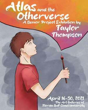
Taylor Thompson ATLAS AND THE OTHERVERSE
Toggle More InfoThe young adult genre is a popular choice among several types of storytelling. For my senior project, I have chosen to create a visual story for this audience in the form of manga. Manga is a Japanese-style comic that is typically presented in grayscale and is read from right to left. While I have created my manga in color, I follow the right to left reading orientation. I wrote and illustrated the story, Atlas and the Otherverse, for the young adult reader. Through my research for this project, I have found that the young adult genre can be used as an escape, both for the reader and the creator. While producing this project, I was able to imagine my own world to create an escape that both the viewers and I can enjoy.
I wrote and illustrated the work for this project with inspiration from my high school years. After isolating myself from friends and activities at that time, art was something I could always turn to, just like Atlas in Atlas and the Otherverse. Stories from my childhood such as The Chronicles of Narnia and The Neverending Story had impacted my way of thinking, pushing me to imagine a new world of my own. Similar to these stories of a child who went through loss and sets off on a journey to another world in hopes of self-discovery, Atlas and the Otherverse follows a young boy who is able to create a new universe through his art. In this first chapter, you will learn about Atlas’s life and how he is dealing with the loss of his parents, leading up to Atlas entering his Otherverse.
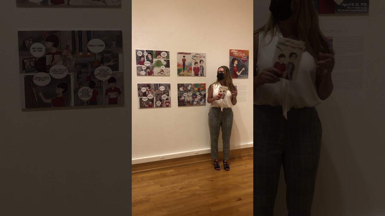
Atlas and the Otherverse was a long process beginning with figuring out the type of story I wanted to tell, whether it be a happy story, sad story, or a story of hope. A mix of the three was a perfect choice, with the storyline and character development coming next. There was much deliberation on the main character and side characters’ personalities, designs, and relationships to each other. Scriptwriting was also a long process at first but quickly became the most interesting part. I tested several mediums and styles when it came to the visual creation of the manga. Traditional watercolor was considered and practiced, although creating this manga digitally on my Apple iPad was the best option since it was more versatile and I could work from anywhere. Being able to recreate the traditional watercolor and ink look on a digital platform gave Atlas and the Otherverse a traditional look while keeping materials to a minimum. I planned out panels and pages on paper, then used those images as a base to create my final pages digitally. After inking in the outlines of the images, I added in the color. Once the inking and color were completed, I moved the pages into Adobe Photoshop where I could add the text. For page size, I kept with the traditional manga size which is 5 inches wide and 7.5 inches tall for the book prints. That size was then able to be expanded to 10 inches wide by 15 inches tall for exhibition.

