Senior Projects, Spring 2019
Wasmer Art Gallery and ArtLab Gallery
Morgan T. Paine and Michael Salmond, Faculty Mentors
April 19 - May 3, 2019
Opening Reception - Friday, April 19, 5 -7pm
Student Presentations at 5pm in U. Tobe Recital Hall with a reception to follow until
7pm in the Arts Complex and ArtLab Gallery
At the end of their studies, art majors are required to develop and present a coherent body of self-generated work. This exhibition combines their knowledge of techniques and concepts while drawing on research of historical and contemporary artists. Each artist in the exhibition designs and creates a unique installation that combines their technical skills and conceptual vision.
Sponsored by The Layden Family Foundation and The Smith Family Foundation of Estero
Image: Installation view showing Senior Projects from Ariana J. Myers, “Swarm”, and Jadon Axe, “Rise and Fall of Idyllic Comfort IV”, 2018. Photograph by James Greco.
-
Isabella Baquerizo WELL KEPT
Toggle More Info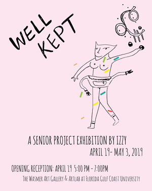
In an era where we are more connected than ever, social isolation has never been so prominent. This social impact creates a juxtaposed sense that everyone is watching and judging constantly. People are more afraid to show who they are and talk about their mistakes because we believe we can’t trust others and we are afraid of being judged. We show people the version of ourselves we want them to see to the point that we believe it’s the real one and we forget who we really are. I believe we should be more transparent with each other, and with ourselves. We all have secrets, and we’ve all made mistakes, but being able to laugh at yourself and your mistakes is an important part of moving on and forgiving. I created a safe space for people to submit their deepest secret anonymously. Even though these are very personal and serious, I took a non-judgmental approach and found humor, empathy, and humanity in them.
I usually illustrate every day moments between relationships, feelings, and concepts that had an impact on me in order to make an experience tangible. For this project I wanted other people to be able to express themselves by telling me an anonymous secret. I created an anonymous submission website and asked my classmates, professors, and friends to submit a secret and to share the page on social media. It was really saddening to read so many secrets about wanting to give up and not loving life, but it was really heartwarming to read the ones about love and friendship. Since these are the type of secrets that we hear more often, I decided to focus on the secrets that were more quirky or weird, because these gave me the best visuals to work with.
I created a digitalized collage, combining my drawings with everyday objects, by doing so I blurred the line between illusory and reality, between something abstract and something representational, between who we are and who we pretend to be. I believe these secrets are experiences that help us remember that we are not perfect, and by learning about them they help us realize that we all have more in common than what we think. At the end of the day we are humans and we make mistakes, but the important thing is to laugh about it and embrace it.
-
Joshua Coe A MIND UNDER RECALL
Toggle More Info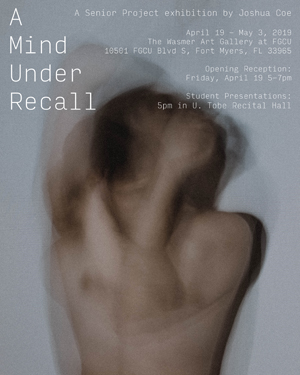
A Mind Under Recall aims to call forth the feeling of a memory, specifically a memory under the stress of grief. This installation is intended to keep the viewers gaze constantly shifting from one piece to another, having to dial in and focus on the smaller and more intimate pieces while, in the next second, having to zoom out and widen their perspective for the larger pieces. Each of the pieces is meant to establish a connection with the viewer through the shared eye contact with my sculptures or the feeling of encroaching on the personal moments in my photographs. These connections are meant to stay with you for longer than you look at this body of work so that, even after walking away, these images are continually being recalled in your mind’s eye.
A Mind Under Recall intends to show how grief generated by the recent passing of a man who was like my grandfather affected my memories and tormented my mind for months. I slowly dealt with my loss and let my mind unleash floods of memories about my grandfather. These memories tapped into a pit of unprocessed grief that was hiding inside my mind which created a looping cycle of new memories taking the place of the old ones. This grief over my grandfather turned into grief over the loss of friendships and other cherished relationships, grief over the loss of familiar spaces, and grief over the loss of people that I have yet to lose. There was no escape from the constant onslaught of images and faces that were running through my mind. So, I allowed myself to watch these memories unfold into a movie that only I could see. I found that there is something beautiful in reminiscing because what you have experienced can’t be relived.
I chose materials that would enhance the feeling of nostalgia that accompanies a memory. Photography has been used throughout history to document our lives and to create a physical snapshot of a memory. Clay has a mind of its own, remembering the touch of one’s hand until returning to the earth that it came from. Each of my photographs was taken with my mirrorless digital camera using a variety of techniques, such as long exposure and double exposure photography. Instead of obtaining a model and staging a scene for my photographs, I allowed each photograph to occur naturally. Carrying my camera with me over the last few months, I was able to capture images of the people that I care about without having to sacrifice the moment in the process; my photographs are imperfect because they are of imperfect moments, paralleling the flawed nature of a memory itself. In the process of capturing the feeling of a memory, I was able to create a memory. My sculptures are meant to express a similar amount of imperfection as they are the physical representations of the faces that fleetingly rush through my mind, slipping away before coming into full view. Through the use of three different clay bodies (Earthenware, Stoneware, and Raku) and their individual firing techniques and capabilities, I aim to represent the unique qualities in each person as well as the specific place that they occupy in my life. While A Mind Under Recall was made from grief, it has become a celebration; a celebration of memories, a celebration of experiences, and a celebration of a man.
-
Marlissa Curley MINDFUL MOMENTS
Toggle More Info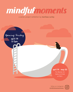
Mindful Moments is an Instagram-based brand built around the idea of improving mental health. Throughout the day, we all experience different levels of stress and sometimes we forget to just breathe. The purpose of this Instagram account is to allow its viewers to take a moment and reflect on their everyday habits, which may or may not be benefitting them. Many times when work or school gets too stressful, I see people get on social media, which is why I chose Instagram as the platform. The mindset of this project is rooted in the “work smarter, not harder” mentality. The act of overworking ourselves often results in less quality work, with an outcome of more stress and strain on our own mental health. Through posting short animations and helpful tips, I aim to remind people that their mental health is just as important as all of the other things they’ve got going on in their lives. The color scheme I use is primarily on the warm side – yellows and oranges promote feelings of energy and happiness – while also have accents of green, which is closely tied to feelings of calmness and belonging. For me it is important to spread mental health awareness in a way that would be accessible, inviting, and informative all at the same time. Mindful Moments combines the power of animation and text to remind its viewers to spend time in the moment, destress, and get into a more positive mindset.
-
Courtney Drymon THE LAST SACRAMENT
Toggle More Info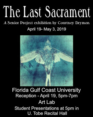
My work here at FGCU has explored themes of mental health imbalance, its reception by society, and my own interactions as a “mentally ill” person with the environment around me. This piece is intended to create a safe place and opportunity for discussion about mental health and how it is handled by those afflicted and by their community. By situating dark relic-like objects in a context that evokes an altar-like structure (the hinged panels sitting atop a predella like structure) it requires the viewer to question if these elements are truly dark or are they merely misunderstood. By allowing the viewer to being to question their own standings, and, open themselves up to new ways and ideas of handling mental health and stability, I hope to create a dialogue that leads to acceptance and understanding.
This work creates a place where others who are of a like mind can feel at ease, and where those who do not understand can learn. This piece is relevant to my own personal experiences in that through research and discussion I have learned that the issues/themes at hand are far more widespread than I originally believed. This was further supplemented upon my discovery of several psychological studies showing that mental health imbalance, and the stigma surrounding it, are an international problem. The piece may be an unconventional means of doing so, but there are times where unconventional means are called for, especially when dealing with topics such as this one. This is a common therapeutic technique, referred to as “Exposure therapy.” Exposure therapy is a method in which the subject is deliberately brought into contact with the things that trigger negative responses. It’s most common use is for curing various phobias. It is something that has been employed on me as a patient, and I feel I have tried to embody in the work. By “exposing” my audience and “triggering” a negative emotional response within a confined, but safe space, I intend to allow the viewers to digest why they are having said negative emotional response. In turn, the attentive audience is then prompted to question their own current viewpoints.
The work was created using the dual techniques of bricolage and assemblage; employing found objects presented on wooden shelving, in boxes and various curio style cabinets, as well as the main hinged body of the piece. The main portion of the work is comprised of various woods, in order to provide a strong support structure. The natural elements inside the curio boxes are cruelty-free collected bones of rodents, fabric scraps, and small taxidermy items. The collected objects were chosen for their commonplace nature, things that a person touches in their day-to-day life that also corresponds to things someone afflicted with a mental disorder handles frequently (pill boxes, notes, various ephemera, etc.) Pairing both literal and metaphorical symbols for pain and apathy, it allows for a more precise read of the message within the work while remaining impactful. By assembling this display atop a coffin containing the fabric corpse of my person, the audience is able to connect these elements with a real human presence.
-
Aimee Farmer DREAMSCAPE
Toggle More Info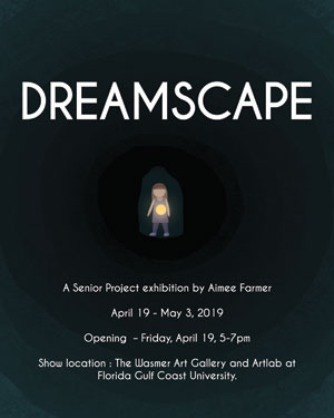
Using the medium of animation, I wanted to use pieces of my own psychology to inspire my work and to tell a more unique story with underlying messages on how people go about chasing, interpreting, and living within their dreams. To accomplish this, I have created a world of whimsy, enchanting people as so many of my favorite creators have done, and who continue to inspire me and challenge me. I met many obstacles along that way that shaped this project into a fluid piece of art that guides you through a window into my subconscious.
Dreams have been a constant in my life, and as the stress of college and life increased, so did the intensity of my dreams and nightmares. This pushed me to use my mind’s eye to create something I felt would be unique. In Dreamscape, a character moves through a series of dream landscapes and scenarios as she chases after a light that has been with her from the beginning. The driving themes of this animation include life and mortality, rebirth, fantasy, and psychology.
The storyline is fluid and organic and perhaps slightly jarring, but I kept it this way in order to be more inclusive for anyone who has the opportunity to see it. Whether or not people remember their dreams, there is undoubtedly something fascinating about our subconscious and the parts of our brains seemingly outside of our control. Even our daydreams can become wild and colorful. The concept of this animation is to tap into the feelings evoked from our daydreams, fantasies, and free flowing thoughts. The mind is a complex thing, and art is a powerful tool to begin to interpret humanity.
-
Emily Gonzalez ROOTS TO FRUITS: DESIGN PACKET
Toggle More Info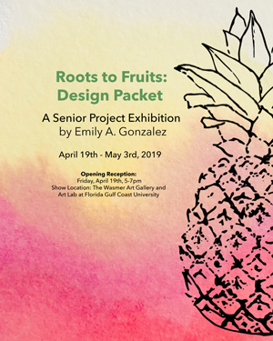
“Roots to Fruits Design Packet” was inspired by the fruits grown at Inyoni Organic Farms located in Naples, Florida. “Roots to Fruits” is a new local food truck business opening soon. They will be selling prepared food items as well as jarred or picked items that where prepared with ingredients grown at Inyoni Farms. Their mission is to make food with the freshest and healthiest of fruits and vegetables. “Organic” is the main idea behind their food. It is important them that that the customer knows that all ingredients that are going into their food was grown without pesticides or synthetic fertilizer.
When designing this packet I kept this term, “organic” in mind. My goal was to create a visual representation of this word. In terms of art, I felt like the term “organic” has a direct connection with handmade or handwritten. For this reason most of the elements in this design are hand drawn or colored. The textures in watercolor paints also allude to this organic feel that is shown through the entire design.
This project gave me the unique opportunity to blend my traditional hand drawn techniques with digital design to give the logo and illustrations the organic aesthetics needed for this project, while still keeping a modern and contemporary style.
-
Camden Gordon NERD
Toggle More Info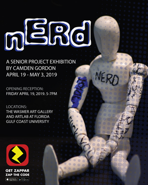
There exists an epidemic that has only ever been on the rise and ruined many children’s lives. Bullying exists in many forms nowadays, and has evolved and adapted to the times, now ranging from physical assault, to verbal belittling, to cyberbullying. It is an unwanted aggression that is overlooked by many people in the United States. According to the 2015 School Crime Supplement, about 21% of students ages twelve to eighteen have experienced some form of bullying in the United States. Nerd is a project that examines and illustrates the effects of bullying and its long-term effects on mental illness and self-image.
As a child, I spent most of my life suffering from a handful of different issues like clinical depression, social anxiety, and ADD, which for a long time felt like it made it impossible for me to live a “normal life”. Due to this, I did not have many friends and was bullied. I always connect with a concept like bullying because it is something I myself have lived through and dealt with, and continue to suffer from the repercussions even today. One way for me to escape the negativity in my life was through reading comic books. I always saw superheroes as much more than just powerful guys punching bad guys; instead they are something to aspire to.
I created this narrative based upon my love for comic books as an allegory for me internalizing my internalization of anxiety and depression, and my struggle to fight it every single day, as well as using it as a “mask” to hide my emotional scars. The photographs here acts as the “surface”, the mask that I allow people see, while the animation becomes the deeper inner turmoil of my emotions. I want to show that these scars can sometimes be on the most unlikely people.
Nerd is a four-part photography and video series that combines several different digital artistic platforms and media, including photography, graphic design, photo and video editing, and interactive design. Using an augmented reality app called Zappar, I invite the audience to “read” my photographs as a short film or stop motion comic book and look past the surface.
.
-
Julia Hancock FEMALE FIRST
Toggle More Info
As a young woman in athletics, finding uniforms that fit a certain “body type” was a struggle. I experienced this as a young woman in athletics, and it truly made me believe that I wasn’t the right “body type” to be an athlete. Those fears followed me from young teenage years and well into my career as a college softball player. I wanted to make a difference and help other young women who felt the same way I did. It was no shock to me to find out that I was not alone is the battle to find uniforms that fit in all the right ways.
Female First is a uniform brand made by women, for women. Women are so uniquely different, and deserve to feel their absolute best when at the top of their game. This brand is personal, authentic, and original. We are changing the narrative by fueling confidence that come from a functioning yet fashionable softball uniform.
We are in the business of supplying uniforms for female athletes that actually are made for a woman’s body ONLY. No longer will young girls have to settle for the “little pink section” amongst the boys. Women will be a first option, never an after-thought. Women’s and men’s bodies are not the same and shouldn’t be treated as such. After research and through personal experience I created a design with forgiving fabric, correct women’s cuts, and extra space where it’s needed.
Displayed are some responses found through my research, different visual elements representing the brand, and an example of a FF softball uniform. The end goal for this brand is to have uniforms available for every sport.
This brand is more about selling the product. It is about athletes being connected with one another, a community of #FemininelyStrong women. Young women in athletics create their own sense of identity through their sport. Female First wants to be a positive and empowering influence on young women in athletics finding their own identities.
-
Kaitlyn Handley INDIVIDUAL BY NATURE
Toggle More Info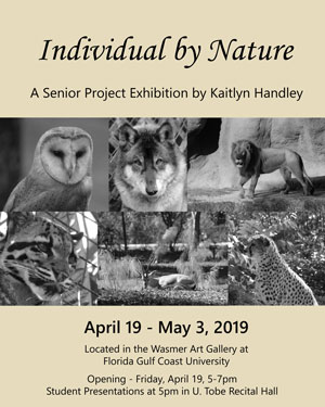
My work consists of a series of solar prints depicting close-up images of animals found in the wild. The small, intimate prints are meant to encourage viewers to make emotional connections to wildlife, as opposed to the materialistic view we often have towards animals. We all have a tendency to get carried away with what is happening in our own complicated lives, myself included, and sometimes fail to respect our fellow humans, let alone the natural world. My work serves as a reminder that we are not the only characters in Earth’s story. These other living creatures are more than just animals- they are individuals with their own personalities, quirks, and habits similar to ours. We are all cohabitants on this planet, more alike than we may initially believe.
Animals have always been important to me throughout my life. I grew up with a backyard full of dogs, rabbits, horses, goats, and more, and was taught to treat all of them with respect and love. They were often friends, and the backyard my playground. I enjoyed being surrounded by nature. As I got older, I saw more of the world and the way other people treated animals. I fell in love with species that I will probably never see in person, and I fell in love with species that may not exist anymore in the next few decades. My concern for other living things has only grown as I have witnessed our habit of only looking inward. We care for what we are immediately exposed to in our everyday lives, and a problem that may be halfway across the globe is a mere inconvenience to us. It is forgotten all too soon. That’s why my art encourages you to stop ignoring what is happening and acknowledge something real, something alive and breathing and looking right back at you.
Solar plates are a relatively new form of printmaking. They are meant to be a safer, more sustainable version of traditional etching, which uses acid to create the image on the plate. As the name implies, solar plates only need the sun. My process starts by collecting reference pictures, which means I either make a trip to the zoo or I spend some time outside looking for the perfect opportunity to capture a photograph of a subject in the wild. Once I have a collection of photos, I choose one that speaks to me more than the others and start sketching. The final drawing is made in ink on clear acetate, which, when pressed against a solar plate and exposed to UV light, is transferred onto the plate through an emulsion hardening process. The softened emulsion where the drawing once was can be scrubbed away, leaving valleys in the plate that can then be inked like any other etching. I chose to put my drawings onto plates because there is something very unique and personal about being able to reprint an image yourself, instead of using a computer or electric printer. I get to ink each plate, tear the paper, and run the press myself every time. The number of reproductions I make means I get to share these thoughts about wildlife with more people and hopefully instigate more conversations about animal conservation.
-
Alyssa Hershman WILD ABOUT YOU
Toggle More Info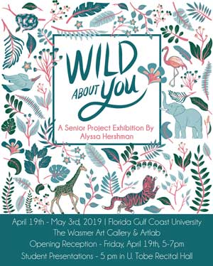
For my Senior Project Wild About You, I designed a production of packaging for a beauty and skin care line that aims to represents everything good on the inside. I have envisioned a brand that offers solutions to the beauty industry by bringing awareness to ingredients while also being kind to our planet. Wild About You strives to sheds light on achieving sustainability by influencing consumers to recycle, repurpose, and reuse containers to prolong product life-cycle. All bottles are made from 100% recycled glass, and consumers are encouraged to reuse and recycle items that have previously been considered one-use disposable items. By being cruelty free, ethically and naturally sourced, organic and vegan, these products reflect not only my personal values, but show care for the planet’s circumstances and limitations. Thoughtful use of resources is part of the Wild About You promise, and is the W.A.Y. beauty should be.
The imagery used on the packages borrow from our environment, evoking the many natural ingredients used in the products for our benefit. Each collection within the skin care line is connected to a wild animal and each scent’s named derived from its ingredients. My own drawing style is used to incorporate imaginative qualities of the animals and plants, and I chose a soft color palette of blues, greens, and pinks to emphasize the beauty within nature and tropical motifs. My intention for the Wild About You collection is to focus on the entire user experience, giving each individual consumer a carefully crafted presentation of a product they are able to implement within their own beauty and skin care routine each day, with a lasting positive effect of happiness and confidence with products they can cherish.
I hand drew all of the illustrations of foliage, flowers, and animals by drawing them digitally with a stylus directly on my iPad. I then brought these graphics to my computer in Adobe Illustrator to arrange multiple patterns, using my illustrations to make four separate collections within the line including Jasmine Jungle, Rosewater Rainforest, Aloe & Tea Tree, and Orchid Blossom. I purchased empty frosted glass bottles and created labels for each of them in various sizes. I mixed several beauty products together to fill the jars to a specific color to match the labels for display purposes only. I designed the outside packaging of the boxes the products come in on cardstock paper by deconstructing boxes with similar shapes to replicate the outlines and dyelines. To complete the entire consumer experience, I made the mailer box that would be shipped to the consumer’s front door. I sized the dimensions for each mailer box and used a template to translate my vision into the printed box. Using recycled cardboard stock, I produced several prototypes that are capable to deliver W.A.Y. products to the end user.
-
Angela Holmlund WILD AT HEART
Toggle More Info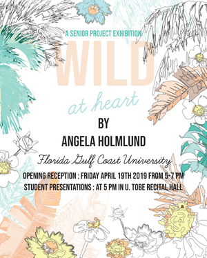
As someone with a deep interest in nature photography and my ongoing love for graphic design; I enjoy combining my two passions into one. I have started exploring in the effect of color and how through color we can share our emotions. By using pastel and bright colors, I show that my designs are meant to be encouraging and cheerful. I am from Florida there, for making me a true Floridian, I grew up with nature all around me, from the beaches to the parks. From a young age I always appreciated nature’s pure beauty. I believe as humans many of us do not fully surround ourselves within the physical environment of nature and realize all the beauty it gives us.
In my senior project I use the connection between my experiences and nature to express how nature makes me feel. The way I see nature differs from day to day depending on our Florida weather, although overall the sunshine state has always been my happy place. By using vivid colors, shapes and patterns I hope to portray my true character within my art, by showing how my personality affects my designs. I want Floridian Vibes to show the community that we should surround ourselves in nature more; to experience what Florida’s natural world has to offer us.
For my project I chose to make 8 digital prints that express the different environments and nature within Florida. I start with my first passion photography and end with my second, graphic design to create something utilizing both. From the beach, which is what Florida is known for; to the swamps and forests where many of Florida’s ecosystems live. I want to express the natural parts of Florida, from the palms to the wildflowers blowing in the wind. This project shows how I feel towards our environment, I hope the viewer will see nature through my eyes after viewing my work and find out how it makes them feel.
-
Raquel Holness NEW WAVE
Toggle More Info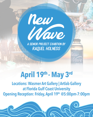
The concept for my project, New Wave, was to create a new range of sustainable products that could also serve as an advocate for an important charitable cause. The focus of this project was to use brand development as a medium to help draw attention to the global water crisis. Water is a natural resource fundamental to survival but people all over the world live without access to clean water. People have to trek miles away from their homes to find fresh water or sometimes their available water supplies are tainted due to industry. My product New Wave Water brings this issue into the forefront and empowers consumers to donate towards the cause. New Wave’s sustainable design also aids in the fight against plastic pollution. By utilizing glass bottles as an alternative to plastic, New Wave Water is not contributing to the plastic waste epidemic unlike most water bottle companies in the USA and other countries.
I believe that we tend to get so caught up in our lives that we forget to be grateful for what we do have. I feel it is our responsibility as human beings to do whatever we can to help other people in need. Even if it is something as simple as bringing awareness to an issue or making a small donation. If we focused more of our energy into helping each other the world would become a better place to live for everyone.
New Wave is comprised of both video and print design elements. The two posters describe the positive concept behind the brand. The package design demonstrates a more sustainable direction towards water bottle packaging. The video illustrates the vibe and overall intention of the brand.
-
Kevin Hughsam ORGANIC SCAPES
Toggle More Info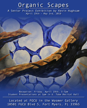
As a maker of paintings, I seek to create another world for the viewer to discover. I strive to create places that appear to be untouched, as I would like the viewer to feel like an explorer. I give no visual cue to whether the places I create are micro-universes or macro-universes, as I let the viewer decide for themselves. I enjoy the artistic freedom granted to me when working in this stylistic convention, as I respect the challenge of depicting everything in a representative manor. The subjects I depict are inspired by microorganisms, science fiction movies, geological rock formations, and anatomy, so my rendering of these subjects tend to appear to be close-ups from nature, microscopic images, and science fiction landscapes. I value the compositional challenges that come when working on a scale larger than the human body. When working with this scale, I intend to envelop the viewers vision to let them truly believe they are present in the space I have created. I invite audiences to escape into the spaces I create with the opportunity to explore a new place. I have created entire realms in my artwork in order to escape from this one.
My work tends to be more representational rather than abstract or non-objective. I begin by working from life and studying the natural world in order to translate the three-dimensional world into a two-dimensional representation. I am interested in how life-like I can portray a subject. I have always been attracted to the beauty of nature and specifically how the geology an area is formed. For this project, I have created ten mini paintings that feature different geological structures I have created, a mid sized painting, and a larger charcoal drawing that both feature different realms of organic configurations.
I am interested in representing pure organic form and texture while also indicating a sense of pictorial space. For my paintings, I work with oil paint due to the versatility of the medium in glazing techniques. I chose to represent my paintings in a monochrome fashion in order to focus more on the form of the subjects being depicted rather than have the viewer distracted by my color selections. The miniature paintings in this exhibition served as studies for forms and structures in my making process to then progress in my larger works. For my larger drawing on paper, I desired to work with charcoals in order create deep black tones and put an emphasis on contrast in my image. When working at a scale larger than the human body, drawing becomes much more of a physical activity. This work also has a grander throwing distance, in which the forms depicted are still comprehensible to the viewer from across the room. My working process tends to begin with an idea of composition, form, or texture and I then push these ideas to create a sense of pictorial space. I rarely start a work of art with a complete grasp of what it will look like in the end of the process. I find beauty is the process of making and believe the piece is done when I find a sense of continuity in the rendering and am tired of looking at the piece.
-
Michelle Marrell WHAT DO YOU REMEMBER
Toggle More Info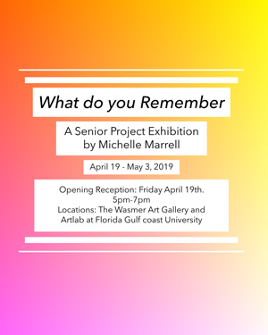
What Do You Remember is a project that uses both the psychology of color and memory processes to represent how one person’s view of colors can conjure up different emotions and memories. Colors effect people in multiple ways. Colors can influence our emotions, our thought processes and can sway us to do certain things. The goal of this project is to have the people become self aware of what colors they enjoy and what memories and emotions are associate with them.
In this project, I reveal what memories certain colors conjure up personally. Some are more personal like how light pink reminds me of my nana and orange reminds me of getting ice cream on a hot day after school at Sun Harvest while others are just fun memories like dying my hair blue to cheer me up one day. This project made me think about how I view colors and made me remember different things from my past that I had forgotten.
What Do You Remember is both a poster and video based project consisting of different colors and the items that were associated with said color. The reason for these mediums is because I want to represent the colors in both in a static form and in motion to portray the emotional and physical ties of the color to the viewer.
-
Christopher McDonald EXPLORING OUR TRANS
Toggle More Info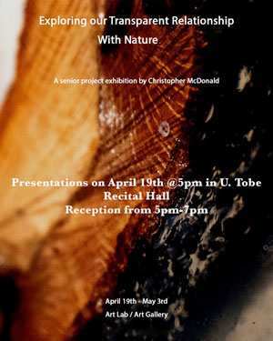
For my senior project I have explored the relationship between two disparate materials: one natural and alive, the other toxic and man-made. While keeping my forms simple, I have created a sculptural series that not only draws people in but encourages them to think about these two elements and how they are coexisting. Wood and resin are very different in many ways but yet work very well together in a sculptural context. By casting resin into wood in different manners, it disrupts the natural beauty of the timber but also enhances some of its details in a way we haven’t seen before. The underlining meaning behind these sculptures are our relationship as humans with the natural world. We are very different from everything else on this planet just like resin is very different from wood but we also have the power to keep this planet alive and the choice to live harmoniously on it with nature. My only intentions for these pieces are for people to view my sculptures and to think about the relationship between the two materials and to consider their relationship with nature and all it has to offer.
Since a young age I have always known that the natural world was something special to me. Growing up, I had a lot of woods behind my house and every chance I had I was out there exploring. Being inside all day made me depressed and I felt like I was missing out on so much by surrounding myself with walls. To avoid that feeling I always try to be outside as much as I can. Once in college I decided to do a little research on the benefits of being outside and found out that it’s normal for me to want to be outside so much. Research shows it is actually extremely beneficial for humans to spend a decent amount of time outside. We begin to feel alienated from nature and we begin to think of it as some sort of problem or annoyance when we are in fact a part of it and need it. With these sculptures I want people to understand that we should not be fighting the natural world but instead finding a way to make sure it’s always around and in our lives.
For these sculptures I am using wood that I have acquired from multiple regional sources. Some I found in Happehatchee Nature Preserve and Koreshan State Park. The rest of the wood I got from a nursery near my home in Tampa Florida that cuts firewood. The other main material I am using in my sculptures is polyester resin. I use Fiberglass Coatings Inc. Clear Cast Polyester Resin for my sculptures because of its strength and clarity. This is one of the more toxic of resins so I have to take a lot of precautions when working with it such as gloves and respirator. For two of my pieces I built molds to cast the sculptures in, for the third piece the wood was the mold and I was able to cast the resin inside it. There are many factors that can ruin the outcome that I have to consider when doing this, such as leaks, leveling and the fact that polyester resin binds to almost every type of surface. I then constructed stands that were TIG welded together and display my pieces at a slight angle back. They are displayed slightly angled so that the viewer as a direct view through the pieces. After completion, they are then displayed on pedestals side by side so that they can be easily compared to each other.
-
Sebastian Melendez THE BIRTH OF BASHTI GRACIAS A LA VIDA
Toggle More Info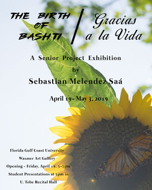
For as long as I can remember, I have been conflicted with the notion of who, what, and why I am. I believe we all have this existential crisis, and we all at some point question our purpose. “What is the point of life? Who are we? What are humans doing on Earth and why?” I have heard of theories and beliefs from my parents, families, and religious teachings that taught me the meaning and purpose of life is because of God. I went to a private Catholic School in California. There, I was taught about Jesus Christ and of his teachings. As a young child, this gave me hope that there was this greater force protecting me and loving me no matter what. This became an issue when, according to my religion, the same God that loved me also would condemn me for my sexuality. This built a lot of shame and guilt in me. I came to terms with being gay, yet I still struggled with my religious beliefs. I was fortunate enough to go to college where I learned so much in my art history courses and grew to understand spirituality in my own terms. I was very lucky to be given the opportunity to go to New York City on the Seidler Travel Grant in August of 2017, where I had a life-altering experience. Absorbing, in person, all the amazing energy from these famous pieces of art from all the galleries and museums we went to really played a significant role in this momentous experience. I went through something so impactful that the only word I could use to describe it would have to be “epiphany.” I felt like I was born again and finally saw the world clearly. I was so ecstatic and felt finally free to live life with more meaning and purpose. All this excitement came to a halt when, sadly, four months later, my mother passed away from cancer. Losing my mother is, and probably will be, the most difficult and traumatic experience of my whole entire life. I was very close to her and admired her wisdom, bravery, strength, and love that what she would say always came from believing and having a close relationship with God.
The art I am expressing is the experience of having this spiritual awakening and of the life, death, and afterlife of my mother. I learned about the Kundalini experience that is sometimes also called the opening of your third eye. This correlates to the pineal gland that releases a substance that comes from your medulla and goes down your spine to your sacrum and back up again which gives this state of enlightenment, of reaching nirvana or heaven. My photographs express the life, death, and rebirth of my personal experience in New York City. I am taking inspiration from all the religious art I saw growing up and also from nature like the caterpillar’s metamorphosis into a butterfly. Studying the correlation of Jesus’ story with ancient Egyptian religion gave me a greater understanding to Jesus’ story and of God. The beautiful life and unfortunate death of my mother and the signs and visions she gave to me are all symbolized in my pieces. The story being told is me coping with the loss of my beautiful mother and growing out of my religious beliefs to a spiritual and loving connection with the universe.
The materials for the cross are wooden pieces cut to fit tightly together and hand painted with different acrylics and markers. The human figure is made from plaster which is gestural and left white for a sense of freedom. The flowers are hand-built ceramic pieces with nails glued as the stems representing my three older siblings and I mourning our mother passing on. The acrylic vitrine is filled with soil and the grass is set on top expressing life on earth. The assemblage piece is layered pieces of wood cut and glued on top of each other and painted with acrylics representing my mother who is looking up towards her favorite flower, the sunflower, which symbolizes the love of what is also referred to as God. The large canvas has a collage of photographs painted with acrylics containing mixed media materials like ceramics and dried flowers which signify visible life even after death.
-
Audrey Mobley WAYWARD
Toggle More Info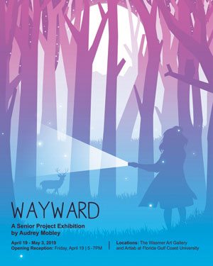
Wayward is a project that reflects my internal struggle with the concept of death and what we might experience after we die. It tells the story of a girl who has unknowingly met her end and is lost in limbo, unable to find her way towards an afterlife. By interacting with other lost souls, gods and demons whose own motives are often unclear, the character must talk, fight, or complete trials to make her way through the various levels of the afterlife so that she can reach the end of her story and find peace. This story is one that is both personal and universal. Most people find the idea of dying frightening, but it doesn’t always have to be. With this project I wanted to create something light and powerful out of a dark subject through my art. It’s my hope that by seeing this topic in a different form, we all might be inspired to find the strength within ourselves to live our lives to the fullest, without the fear of what comes after.
My goal with this project was to work through my personal thoughts and feelings about the inevitability of death and to find something beautiful in a scary topic. Ever since I can remember I’ve had anxiety, especially anxiety related to either myself or those I care about passing away unexpectedly. This worry has made me apprehensive to go to new places or try new things, but as I graduate college, I find myself looking forward to those new experiences and am excited to share them with the people I care about. I have created artwork for a video game concept that reflects this mental and emotional transformation a person can go through as they grow and experience new things. Death is scary, but it is inevitable. We can go through life afraid to have new experiences or to be different, but no matter what it ends the same way for everyone, so we might as well enjoy it while we can and make the most of it with those we love.
Wayward is a digital print and trailer-based project that is meant to communicate the atmosphere of a concept for a video game. The posters show various characters from the game based upon the aesthetic of Tarot cards, as well as marketing materials and an animation of gameplay concepts. Combined they create the visuals and aesthetics of Wayward. -
Allana Nagy BENEATH THE FLOWERS
Toggle More Info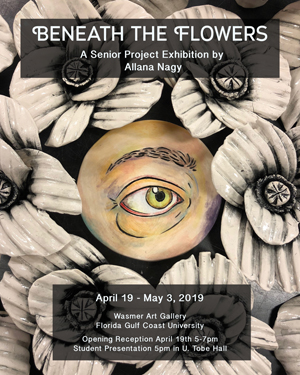
My senior project is inspired by the death of my father and how detached contemporary mourning practices are. After his death I felt like I was pressured to go back to a normal life and pretend I was okay. I was not given enough time to mourn his death because we live in a society that is always pressured to be productive and happy. It is a year after his death and I am still dealing with this sense of detachment. I looked back at how mourning practices were done in the 18th century and came to appreciate how personal and extravagant their relationship with death was. Looking at Victorian mourning jewelry called “lover’s eyes,” flower arrangements, funeral photography, and other women’s handcrafts, I felt they had a connection to their loved ones that I was unable to have. I chose the eyes of my family, because eyes have a sense of intimacy; you need to be close to a person to see their eyes clearly. The “lover’s eyes” broach of the 18th century allowed one to always have a reminder of the deceased. By enlarging the broach and constructing it in a personalized ceramic style, I was able to apply this memento to my own family. This project gave me the opportunity to memorialize my father postmortem and my own family as we are now. This body of work is inspired by the death of multiple family members over the past two years. I had never been exposed to a human death before then and in the span of six months I lost my father and a cousin who was only a year older than me. When my Dad died, I was only able to take a week off school for fear of falling behind in class. I was not emotionally ready but I went back anyways. I have always been interested in history, especially the Victorian period, and was captured by their fascination and romanticization of death. Women of the 18th century spent years in mourning, created many crafts that memorialized the deaths of loved ones, and planned elaborate funerals. I felt denied the opportunity to mourn my dad and longed to have the time to reflect on his death like the women of the Victorian Age. Looking at handcrafts that were dictated as “women’s work” I was drawn to memento jewelry and wax flower arrangements. These took the form of broaches that could be worn and used as a constant reminder of the deceased. I wanted to place all my grief into an object and was able to do it in the enlarged eye sculptures and flower arrangement. This project gave me the time to reflect on life, death, and the importance of family which I was previously unable to experience. For my senior project, I decided to use clay because of its versatility and fragility. I used a white, porcelain based clay for the entire project. Porcelain gave an extra sense of delicacy and softness to the flowers that surround the installation. The flowers are inlayed with a glossy black glaze, bringing out the texture of the petals. Each eye sculpture is covered in a combination of underglazes, low fire glazes, and mother of pearl luster. The underglaze has been watered down and applied in a painterly fashion similar to watercolors. The low fire glazes, like the white crackle glaze, give another sense of depth and texture. The ceramic pearls surrounding the sculptures were covered in an overglaze called luster. This luster gave an iridescent shine that is similar to a pearl. The eye painting, the frame, and the pearls were all made separately, then glued together after all firings and surface decorations were complete. This multi-step process gave me the ability to work on different parts of the sculptures separately and allowed me to make refined visual choices.
-
Juliana Newman THE LANDS BETWEEN
Toggle More Info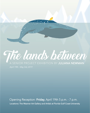
Many people lead lives that feel consumed by work, stress and doubt, as if there’s no time for unqualified happiness while we’re busy chasing goals and meeting deadlines. As an artist and designer, I believe I can create experiences that just for a short time pull people away from the daunting thoughts of their day-to-day tasks and introduce them to unalloyed joy. The Lands Between is a body of work that uses animation to connect the viewers to a lighthearted story about a bear searching for love. My overall motive was to captivate and involve the viewer, while sparking childlike excitement and wonder, which are both feelings that seem to be buried a little deeper within our couscous minds as time continues to pass.
Audiences viewing my project are invited to unveil a third dimension and discover the story that lies just beneath the 2D prints hanging on the wall before them. After experiencing my work in its tangible print form, the viewer is prompted to discover the project’s third realm through augmented reality. The virtual reality dimension of the piece separates the viewer from their physical ‘now’ and brings them along on a quirky journey as the story comes to life through animation
The narrative is focused on a character named Bear, who comes across a bear-shaped snow mound in the woods. Bear puts many efforts towards making a connection with the fellow bear, which tragically melts overnight as he sleeps by its side. Bear finds himself alone once again when a bird swoops down and snags a scarf that lies where his snow friend once stood. Bear immediately embarks on an unexpected journey, in which he remains innocently optimistic and open-minded while blindly following a yellow bird with a scarf. As he’s introduced to the world around him, Bears’ focus shifts and he starts to enjoy the journey across lands leading towards destinations unknown. The animation is a metaphor for the importance of relinquishing some control of everyday life and slowing down to enjoy the journey. Regularly chasing after a final destination may result in us missing what we may have truly needed all along.
-
Darice Pollard VISUAL AFFIRMATIONS
Toggle More Info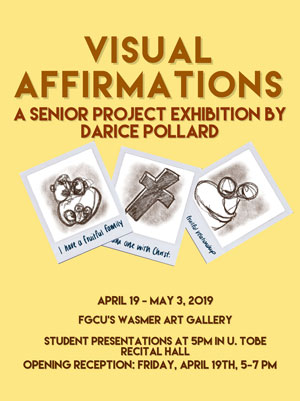
My senior project, Visual Affirmations, utilizes illustrations of polaroid pictures to forecast the prosperity of a pioneer (myself) who will disrupt a history of broken families. This collection of affirmations is centered around finding success in education, employment, family, etc.- areas of life that previous generations never acquired success in. Affirmations are positive statements/ images used to practice positive thinking and self- empowerment—fostering a belief that a positive mental attitude supported by verbal affirmations will spell achievement. Moreover, family households plagued by toxic relationships, single parent households, imprisonment, low-level education, substance abuse, unemployment, and/or neglect are more vulnerable to harvesting low-achieving youth- a complex set of circumstances that plagues many African American households. So, it is important that the youth have positive examples for them to follow and also look forward to. These images do this exact task for me. The concept of polaroid pictures reinforces the proclamations by establishing a sense of familiarity and personalization, which makes the imagery/ aspirations seem more obtainable.
Because I come from instability, I have aimed for just the opposite by making choices contrary to some of the loved ones around me. Having never drank, smoked or used drugs, this album is an extension of my “extremist” philosophy where I set ambitious expectations for myself to increase my likelihood of eluding a familial cycle of mediocrity. Fortunately, this
philosophy has resulted in me being a first-generation college student, but I have a shortage of representation/ examples to follow. Visual Affirmations will serve as my creative vision board with lively and sentimental imagery of photos that document important moments and milestones I currently strive to actualize in my own life alongside my mentor and boyfriend of five years. On a grander scale, I aspire to inspire young African Americans with positive imagery of our people. I believe diversity and representation in art is very important because it impacts how we view ourselves and it makes things like success, happiness, perseverance, etc. real to an audience of people who may not have an adequate example in their community.
For my project, I used Prismacolor Color Pencils, Copic markers, Prismacolor Markers, and Farber Castell Polychrome Color Pencils to illustrate 8 images. Some illustrations were framed with a white border to imitate a polaroid picture. I wrote positive affirmations on the border of each framed illustration and underneath each unframed illustration. The 8 images were then strategically arranged in four categories that pertain to the areas of life I desire success in.
-
Hadasa Romero BORDER STORIES: A DOCUMENTARY HISTORIAS FRONTERIZAS: UN DOCUMENTAL
Toggle More Info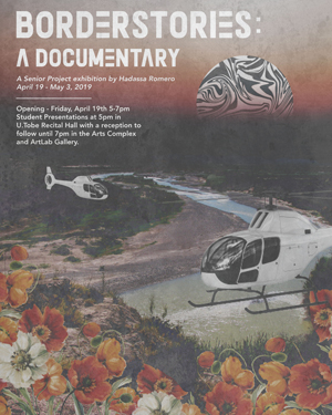
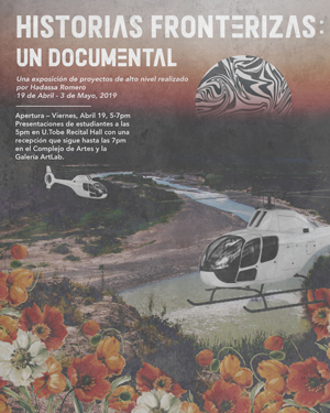
To every immigrant, every child of an immigrant, or any person related to an immigrant; this is for you.
Border Stories came about from the desire to inform audiences using real stories on why people, specifically Latinos and Latinas, immigrate to the United States. There is a stigma put on Latinos and Latinas that stems from the necessity to leave their countries in search of better opportunities in the United States. However, many people do not know of, or are ignorant to those necessities, and instead believe in the stereotypes that Latin people come to the USA to steal jobs or to indulge in criminal activities. This project challenges the audiences assumptions on immigration and on Latinos and Latinas in the United States. In this documentary, people share their stories of the hardships they faced while crossing the Mexican-American border seeking a better life. A Latino/Latina’s decision to cross the border in the United States illegally is never an easy one, and I want audiences empathize with each person and their story and learn from them and pass that story on to others.
As the child of immigrant parents, the topic of race and racism in America has always been important to me. Although I am an American-born citizen, I have still experienced the emotional toil of racism. I have found that although stereotypical thinking and racism may rise out of hate, it is also a product of lack of knowledge. There are those who might believe that Latinos and Latinas immigrate simply to “steal” jobs, when in fact they are running from severe gang violence in their countries. I have heard people talk of how people who cross the border are dangerous criminals, whereas my mother and father have done nothing but make me feel safe and loved.
This project is a 15-minute documentary that tells the stories of 2 people who crossed the Mexican-American border. They speak of their experiences, along with their reason for crossing and their message to people with negative stereotypical thoughts. Included is also commentary by Lirio Negroni, an Associate Professor of Social Work at Florida Gulf Coast University; Dr. Negroni shares an academic narrative on who Latinos and Latinas are, and the difficulties of coming to the United States legally, which in turn many times leads to their crossing illegally.
A cada inmigrante, cada hijo de un inmigrante o cualquier persona relacionada con un inmigrante; Esto es para usted.
Border Stories surgió del deseo de informar a la audiencia utilizando historias reales sobre por qué las personas, específicamente las latinas y latinas, emigran a los Estados Unidos. Hay un estigma en latinos y latinas que surge de su necesidad de abandonar sus países en búsqueda de mejores oportunidades en los Estados Unidos. Sin embargo, muchas personas no conocen o ignoran esas necesidades, y en cambio creen en los estereotipos de que los latinos vienen a los Estados Unidos para robar empleos o realizar actividades delincuentes. Este proyecto desafía los supuestos del público sobre la inmigración y sobre las latinas y latinas en los Estados Unidos. En este documental, las personas comparten sus historias sobre las dificultades que enfrentaron al cruzar la frontera mexicano-estadounidense en busca de una vida mejor. La decisión de un latino/latina de cruzar la frontera ilegalmente a los Estados Unidos nunca es fácil, y quiero que el público tenga empatía con cada persona y su historia, y que aprenda de ellos y comparte esa historia a otros.
Como hija de padres inmigrantes, el tema de la raza y el racismo en Estados Unidos siempre ha sido importante para mí. Aunque soy un ciudadano nacido en Estados Unidos, todavía he experimentado la labor emocional del racismo. He descubierto que aunque el pensamiento estereotípico y el racismo pueden surgir del odio, también es producto de la falta de conocimiento sobre el tema. Hay quienes podrían creer que los latinos y las latinas emigran simplemente para "robar" empleos, cuando en realidad están huyendo de la violencia de pandillas en sus países. He oído a personas hablar de cómo las personas que cruzan la frontera son delincuentes peligrosos, mientras que mi madre y mi padre no han hecho nada más que hacerme sentir segura y amada.
Este proyecto es un documental de 15 minutos que cuenta las historias de 2 personas que cruzaron la frontera mexicano-estadounidense. Cuentan de sus experiencias, junto con su razón de cruzar y sus mensajes a personas con pensamientos estereotipados negativos. También se incluye un comentario de Lirio Negroni, profesor asociado de trabajo social en la Universidad de Florida Gulf Coast; La Dra. Negroni comparte una narrativa académica sobre quiénes son los latinos y las latinas, y las dificultades de venir legalmente a los Estados Unidos, lo que muchas veces los lleva a cruzar ilegalmente.
-
Sean Shinham INTERPLANAR DIMENSIONALITY
Toggle More Info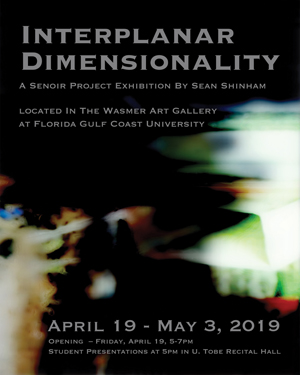
Reality, a construct of human perception, is extremely limited due to our lack of acceptance of anything more complex than what we understand with relative ease. Through representations of beings, living within an interplanar dimension that has a direct impact on our lives, I explore complex topics of emotional and highly personal experiences that affect the lives of people I am close to. The sculptures I create are simply physical manifestations of the beings that I see living among us and touching our lives; however, these are only my interpretation of life forms, that with proper focus, can be seen by anyone. The sculptures are representative of the beings that would cause phenomena such as chills down your spine or a tight feeling in your chest that we identify as physical responses to emotional stimuli. These experiences are caused by life forms shifting between planes in a proverbial limbo, a sea of experiences outside of time and space, touching our world in ways too complex to understand. Therefore, while however abstract, they become shadows of the human experience as we grapple with an afterlife or spirits within a reality of unexplainable interactions with things outside our reach.
Life and interactions between all life forms within space are an important aspect of understanding my work both conceptually and physically. This is something I am constantly adapting and changing with as I explore more deeply this metaphysical world. Attempting to obtain a grasp on this reality, and the way it works, I take a journey through art and its conceptual presence as well as through science, physics, mathematics, psychology and even simple observation of the way we interact within our reality. Researching complex topics to gain a developed understanding of our experiences through a process of both isolation and subsequent communication with others, who understand and contemplate ideas outside the norm, have been a very large portion of my life. My belief that every cause must have an effect and every effect must also have a cause is something that has driven my intellectual journey up to and through the collegiate system.
In order to present these beings in a way that can be comprehended by people within our reality, it is necessary to approach the use of additional senses and modes of perception such as time-based media. Using sound creates an environment in which interactions between beings can take place. The design of the video displayed, conversely, gives the viewer a glimpse of how these beings may perceive reality. The use of layered footage demonstrates multiple timelines being experienced simultaneously, while the darkened portions of the screen are where processes and things outside our possible perception reside. Using fur and bone over a steel frame gives structure and life to the beings. While they do not fully capture the complexity of these life forms, the sculptures serve as a suggestion of each being’s physicality within an interplanar 6th dimensional space.
-
Lauren Tolan WINDOWS OF PERCEPTION
Toggle More Info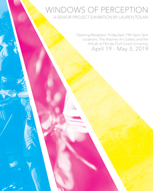
Trying to explain the difference between what is real and true is pretty much an exercise in subjectivity. Every person has varying opinions and perceptions based on his or her own experiences. As an artist/designer I find beauty in everything around me, whether it be a rusted street sign, or an open field. But what is it about those seemingly insignificant things that make them beautiful? This project serves as an exploration of the common links between multiple perspectives. As we grow, our perspectives change, whether that be our perception of the world, ourselves, others, the media, or life. It is my goal to document this process of growth and development within myself and others, through the mediums of art and design.
The number three has been used as a symbol for perfection and divinity. There are many different perceptions of the nature of this number across religion, mathematics, and art. The Pythagoreans taught that the number three was the first true number. It is the first number that can form a complete geometric shape. It has been considered the number of balance, harmony, wisdom, understanding, completion, perfection and time. It is universally known as a number of good fortune and the number of the divine. In the art world, we use the number three to divide our content evenly, with what we refer to as the rule of thirds. When we see the number three it is a reminder from the universe of our creative potential and our innately divine nature. In spirit of that idea, I chose to divide my project into three content areas. To give me inspiration for the images I created, I interviewed nine people, and illuminated their ideas through photography, illustration, and digital design. Keeping with the theme of threes, there are three panels, each containing three layers of design, representing one of the nine perspectives from my interviews.
I used vertical shadow-box frames to display my work, as well as LED lights. There are three “perspectives” to each frame, and in white light you can see them all. However, when under red, green, and blue lights, the piece separates out each layer. This is a metaphor for the physical similarities and differences between each persons’ perspective. By freezing moments in time and perspectives of youth, viewers will be able to stop and appreciate each little moment and engage with it. It is important to me that art and design be integrated. I strive for my artwork to fulfill design aesthetics, and for my design work to have roots in art and art history. However, no matter how many outlying influences I have in a given piece, the premise is typically central to my life. To know my work, is to know me.
-
Renia Williams-Simmons INEVITABLE
Toggle More Info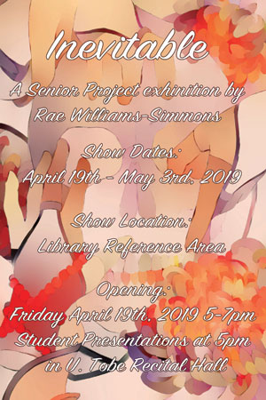 I have created these pieces to explore the ideas around the acceptance of human death. Focused on the skull, I have been studying the structure from different perspectives and figuring out how I could make them presentable to others. The skull is almost always seen as a symbol of death, it reminds us of our mortality. Death is not an easy subject though it is something that will touch all of our lives at some point. I have created works that show both living and dead elements of the human body such as the skull and hands. I have found that often people are ok with the death of an animal; it is pushed aside as a normal occurrence, but the death of a human is seen as something that should never be allowed to happen, and that some higher thing has betrayed us.
I have created these pieces with the intention to show that even death has and can bring to the table its own beauty. Death can be ugly and disgusting if we let it be. Though its not always easy to celebrate the loss of a loved one we do not have to view it as something to turn away from. I have incorporated chrysanthemums specifically into my pieces as accents to lighten up the atmosphere around the dead. I feel as though this type of flower had been used in a way that when we view it, we have to think about what is there on the paper with them. I have also included representations of the living to symbolize the fact that though we pass we still have a connection to those no longer with us. I hope that with these details the viewers will take the time to really look at each piece and find their own connection to them. Death is inevitable, it is something we all try to get away from but can’t and I hope the art I have created can convey that as well as convey that death does not always need to be viewed this way.
I have created these pieces on cold pressed water colour paper, first drawn in blue and standard pencil. I layered on colors as washes to get the general idea as to which colors would help certain elements stand out and then went from there. I did a lot of thinking before starting these pieces but did not sketch out any thumbnails as they were not needed. For some of my images I have used other web-based references as there were quite a few diagrams and drawings posted there which I did not initially find through google. Other resources would be my imagination and conversations that I had with friends; doing so helped me see how they viewed he topic that I chose to work with. I wanted these pieces to be as natural as possible to me, so cutting out the thumbnail process kept me from editing the images too much and kept me focused on how the pieces were developing in the moment. This also allowed the pieces to gain characteristics of how I felt in the exact moment that I was drawing and painting the images. Some other things that I had to carefully consider while making the pieces were how I could make certain things flow better and together. In order to get that feel I decided to paint representations of fabric, I feel that this helped create a sense of movement throughout the piece and further emphasize the direction that I wanted the viewers eye to follow. I added gold leaf trim and used iridescent watercolors in certain areas that I believe helped enhance the pieces further and pull the viewer back in. This is important as most may be moved away from the subject presented but hopefully drawn back by the visual elements that stick out the most when least expected.
