Senior Projects, Fall 2018
Wasmer Art Gallery and ArtLab Gallery
Andy Owen, Faculty Mentor
December 4 - December 14, 2018
Opening Reception - Tuesday, December 4, 5 -7pm
Student Presentations at 5pm in U. Tobe Recital Hall with a reception to follow until
7pm in the Arts Complex and ArtLab Gallery
At the end of their studies, art majors are required to develop and present a coherent body of self-generated work. This exhibition combines their knowledge of techniques and concepts while drawing on research of historical and contemporary artists. Each artist in the exhibition designs and creates a unique installation that combines their technical skills and conceptual vision.
Sponsored by The Layden Family Foundation and The Smith Family Foundation of Estero
Image: Installation detail, Charlotte Slabach’s Senior Project “The Gate”, 2018. Photograph by James Greco.
To see more photos from the exhibition, please visit Flickr.
To read more about each Senior and their projects, click on the green button beside their name, below:
-
Carly Cooper MEMENTO MORI
Toggle More Info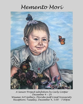

Life is temporary. Through symbolism attained from the Renaissance Vanitas and Memento Mori pieces, my work captures the essence of how death is inevitable and that we as human beings will eventually die. The symbolism in the work alludes to historic religious ideals and beliefs about what is to come once we perish, and it gives the hope that there is something for us after we pass away. My Senior Exhibition focuses on the idea of one’s mortality. Life is precious, it is short, and no one knows when it may end. As human beings, we each hope to grow from an early age, experiencing both the good and the bad, so that once we hit old age we can look back and reminisce on a well-rounded life. We urge for a life that's filled with heart break, romance, adventure, the beginnings of a family, and so on. The Latin term “Memento Mori” is translated to “Remember you must die” in English. It is a medieval Christian term that focuses on one’s mortality and the idea that once I die, I cannot take my wealth, earthly goods or pursuits with me. It is a reminder that I should not dedicate my life to living in vain but to dedicate my time bettering myself, my soul, and helping others along the way. The vanitas theme is a very important concept and is utilized throughout this exhibition as well. The vanitas still-life paintings first flourished in the Netherlands in the 1600s; They incorporated objects such as time pieces, skulls, burnt out candles, and dying flowers to emphasize that dying is inevitable and that time will not stop. They serve as a discrete reminder of mortality and highlight the importance of the church and one’s spirituality.
These drawings represent a progression of my life, from early childhood through my late adulthood. I, myself, am coming to terms with my own mortality and what is to come after I die. It is a scary revelation, but I feel that it is a topic of utter importance that everyone eventually will question one day, whether it comes at a younger age or later in life. I chose to utilize self-portraits because this topic is very personal to me. Playing off my religious values, art history has always been exciting and influential to my art. The vanitas genre caught my interest many years ago and learning about their objects’ symbolic meanings helped me to understand my goals for my exhibition more clearly. My intentions were to meld together the objects of the vanitas genre, typically a still-life genre, into one piece that primarily featured portraiture. My goal was to use this strategy to emphasize mortality and historical Christian ideals in a discrete but powerful way. Using imagery with examples such as butterflies to represent the soul, ivy to symbolize eternal life, and a peach to symbolize truth and salvation, I explore the ideas or mortality. Life is truly precious, and death is inevitable; shouldn’t we inspire hope to what is to come?
I have utilized my familiarity with colored pencils to create the work seen in my Senior Exhibition. The work was done with Prisma color pencils on Strathmore paper. Instead of allowing my mark making to be shown, I have chosen to smooth out my colors by utilizing white colored pencils as a varnishing tool. My method of creating these pieces is one that creates a smooth transition of color and value. When it comes to my color palette, it has always and constantly been one that highly utilizes reds and blues, especially in the skin tone. I use them throughout my pieces intuitively and rely heavily on instinct. The cool tones surrounded by the warm tones bring a sense of life to me, one that I want to fill my art with as well.
-
Lindsay Dawson ILLIBRIUM
Toggle More Info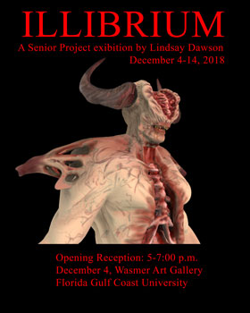
Ever since I started my journey in the digital media field, I discovered that special spark that sets me apart from my peers in the industry. I have found my true passion through animation and digital modeling. The power and ability to bring a visual piece to life is extremely rewarding, as I know that my audience will experience delight, and enjoyment through my creativity. I want the audience to be just as involved in my creation as I was while creating it. My hopes are that my audience will consider my motives behind my creation. This demon is a representation of the hard work and struggles I have faced and the realization that I can do whatever is thrown my way.
Growing up I have always been treated differently, like I am something to be avoided like a plague. I am always looked at differently and it is as if to people my disability screams ‘stay away from me’. I feel like my demon expresses how I feel people see me, as some strange creature that does not exactly belong. The ideas in my project showcase how I feel when people side glance me as if I am a disease. During my research for this project, I came across an article titled “There are Worse Things Than Death”. In that article I came across a sentence that really resonated with me, “there are things that are worth more to fear than death which is disabilities” (Thagard, 2012, par. 4). My goal within this project is not only to evoke horror and fear but also to show viewers that, no matter the trials life throws at you, you can still endure. Also, I wish to express that even though you might look different from others, you are still a physical being and are not so different on the inside.
To make my demon, I used three computer programs called Autodesk Maya, Autodesk Mudbox and QuickTime Player. I sculpted the body of the demon in Mudbox and used Maya to make the horns from there I transferred the horns back into Mudbox and attached the body and the horns together to make everything connect. For my turntable, I used a different program called QuickTime Player. To make my posters I used Adobe Photoshop. When it was time to print and mount my posters, I went to Office Depot to have my four posters printed on matte paper and also had them mounted with Foam Core and hung them on the wall. I drew upon other references, such as Xenomorph from Alien and the Vitruvian Man by Leonardo da Vinci. Making this demon come to life through the digital world showcases my abilities as an artist.
-
Gianna Dubay A PLACE TO CONNECT
Toggle More Info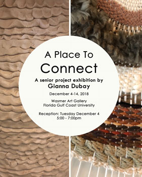

Language is what makes us human and is our primary tool for interacting with each other. Traditionally, this meant speaking to the person in front of you, but with recent technological advances, it can now mean typing messages behind a screen to a person on the other side of the world. Historically, we have questioned our relationship to technology from the late 18th century Industrial Revolution to our current dependence on digital devices. Cell phones and computers allow us to communicate with co-workers, family, and friends that are miles away, but when we are physically together, they often hinder us from being fully present. With a more mindful way of interacting, I believe a balance can be reached in our use of phones, computers, and tablets. For this exhibition, it was essential for me to explore the handmade in using clay and fibers. These materials demand my full presence and serve to symbolize the complex interpersonal relationships in my own family.
This installation represents my solution for finding a place to connect with my family. In conversations with my grandmother, I discovered how her memories of childhood and parenting incorporated a very traditional dinnertime where the family came together every night. That was their one time to share with each other and connect their separate lives. Today, a common dinnertime is hard to accomplish in my family. Despite different jobs, technological distractions, and varying school schedules, I see the importance of finding a shared time that is set aside for all of us to be together. The family unit is where I learned values, tradition, and responsibility, and this will forever affect how I interact with the world around me. Each of the eight coil-built pots represents one of my family members and their individuality. The sculptural weaving at the center becomes the conversation that connects us. By using multiple different materials together, I am able to express how we can consciously weave our lives back together.
At the age of 9, I learned to knit from my aunt, a tradition that has been passed down for generations. This practice represents a direct connection to my family, and fibers became a necessary material for this body of work. The central feature of my installation is a large scale mixed media weaving, which began at an off-centered point on the loom and spiraled outwards. Layered rings reference change over time like annual growth rings in trees. As the growth rings provide a cross-section of information on a tree’s history, this weaving creates a cross-section of my family changing over time. For the past several years, I have also been consistently working in clay. With this project, I saw how coil building with clay is so similar to weaving; the final forms are connected and well blended but made up of individual components. I prefer coil building because it shows the intimacy of the artist in each pinch of clay and requires me to be completely present. My construction process is inspired by traditional Pueblo Corrugated Ware (800BCE). Choosing this method was imperative to show how the beauty in ancient practice parallels my own response to modern communication. The form of each pot reflects each person’s character, and the use of coils connects us as a family. Each different surface on the pots, and the many colors and textures in the weaving, become indicators of our diverse life experiences.
-
Amber Frank COME ON IN, THE WATER'S FINE!
Toggle More Info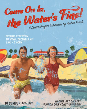

My senior project, “Come On In, the Water’s Fine!”, highlights the effects of the harmful algae blooms caused by human activity that have been plaguing the state of Florida since late 2017. Human beings have always had a relationship with and dependence on nature, but we are increasingly becoming disconnected from that relationship as we use and abuse the natural world for our own benefit. We have shifted into the Anthropocene, the current geological period where it is human activity that is the dominant influence on climate and the environment, rather than nature itself.
As someone who grew up in Southwest Florida, I know the importance of protecting our local environment. The economy in Florida is largely dependent on ecotourism and people flock to this area primarily for the climate and beaches. Unfortunately, those in power in our government are not immune to the widespread disconnect with nature, viewing it primarily as a resource to meet human needs. Over the past century, Lake Okeechobee has been dammed up to provide irrigation to the sugar and agriculture industry and to control water levels in the middle of the state. Freshwater that once flowed naturally south has been diverted from the lake through the Caloosahatchee River which spills into the Gulf of Mexico. This freshwater is contaminated with nutrient pollution meant to fertilize crops, but instead has been feeding harmful blue-green algae and red tide blooms causing damaging effects to the health of marine life and coastal communities. In my work the juxtaposition of cheerful people and slogans with images of the devastation brought on by red tide represents the Florida government’s failure to properly address the problem. My hope is that my work will evoke a sense of urgency to reexamine our relationship with nature and to protect it before it is gone.
For my project, I have created a series of posters that form a sociopolitical commentary on the ongoing environmental crisis in Florida. I chose a vintage “Old Florida” theme for my work in order to evoke nostalgia for the bygone days when Florida’s beaches were healthy and tourists abounded. I used vintage postcards and tourism advertisements as source images, digitally recreated them and manipulated the images to include the effects of the toxic algae blooms that were and still are present in Southwest Florida. While the situation is not to be taken lightly, sometimes the best way to talk about something heavy is through satire. By including slogans meant to attract tourists to visit our state over the images of devastation, I am criticizing the government’s lack of action while they continue to encourage tourists to visit. Much like our government, I am telling the viewer to “come on in, the water’s fine!”
-
Brandon Gebert WHAT IS LIFE WITHOUT THEM?
Toggle More Info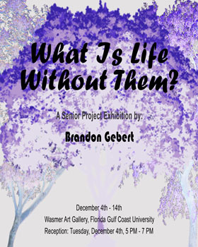
Take a deep breath in…take a deep breath out. Now, try holding your breath for as long as you can. It’s hard, isn’t it? That’s what it would feel if oxygen didn’t exist. These things are found everywhere, they surround us, and they come in different shapes and sizes. These things are called trees. Without them, life on Earth would cease to exist. To me, they are more than just living things, they are a symbol. Trees are a not only a symbol of growth & opportunity, but they are a symbol of life itself.
To recognize life and our existence, my installation consists of three photographs of trees (titled: From a Distance, Branching Out, and Cross Multiply) and a full-round sculpture containing a set of three trees. The forms that encompass and connect the tree-like forms are roots, symbolizing that everything in life connects to one another. In philosophy, this is known as the Gestalt theory which covers the following five principles: proximity, similarity, continuity, closure, and connectedness. This theory emphasizes that the whole of anything is greater than the sum of its parts. Trees are also an analogy for people as trees grow, become old, and die, just like we do. Like people, trees are unique in their own way because no tree is completely identical to another. Like people, trees also need each other to survive and thrive in an environment just like how people need one another to endure and grow.
My full-round was constructed using tables and wrapping them with aluminum foil, tape, and plaster bandages which would serve as an anchor for the roots connected to one another. The same process was used to create my version of trees and the roots connecting the full-round. As my full-round is titled, Purity In Death, the trees are without leaves, symbolizing the sacredness of death, immortality, and knowledge. The color of my full-round is my interpretation of death as something that happens to all living things and cannot be escaped from. The materials I used for my full-round are completely intentional. The use of aluminum foil to “grow” the full-round through layering the trees and roots are analogy to how trees grow. On the other hand, the layering of plaster provides realistic textures reflected in my full-round. The photographs, on the other hand, were taken with my Nikon camera and enhanced using Adobe Bridge. My photographs are printed and mounted in foam core. In contrast to the color of my full-round, these photographs of trees, are a symbol growth, positive energy, and the living. These photographs contribute to the yin & yang and how opposite forces are complementary to one another and interconnected. Without trees, there is no us and no life. Trees are what binds the world together.
-
Taylor Hallbeck THROUGH THEIR EYES
Toggle More Info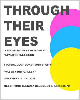
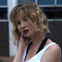
In society, it is important to question what is deemed normal and accepted. As we progress as a culture, there becomes a greater need to question what does not feel instinctively correct. Toxic masculinity is a term used to describe the harmful social expectation for male behavior to be centered around repression an aggression. This expectation has created an “ideal” man where emotions are viewed as a weakness and traditionally feminine traits can take the status of “man” away. Ideas such as suppressing emotion and hyper dominance reinforce gender stereotypes placed on men at birth. Through Their Eyes will be focusing on the emasculating effects of modern men due to toxic masculinity. Emasculation is the idea that there is a range of feminine interests and activities that a man should not hold and that these said interests invalidate a man’s masculinity regardless of his actions.
As a feminist, it is essential for me to examine the broad spectrum of healthy gender expressions. It is specifically important to me because toxic masculinity promotes both sexism and dangerous stereotypes of masculinity and femininity. I wanted to address the softer side of masculinity and the emasculation of men because of its connection to femininity. Men expressing themselves through fashion, embracing their feminine qualities, and exhibiting vulnerable emotions such as sadness should not make them any less of a man. Toxic masculinity is an important discussion to have because it is harmful to everyone. The effects of toxic masculinity are seen in men, but if reduced, can benefit all people in society.
The initial stages of my exhibition began as a series of small acrylic paintings. These paintings explored how to best represent the hindering effects of toxic masculinity utilizing color and form. Once satisfied with my connection of form to content, I began my application of acrylic paint to three 45” Masonite circles. The Masonite circles are hung on a one inch wide wooden frame that has been mounted to the back of the panel. Through repeated applications and layers of acrylic paint, I attempt to create a feeling of raw emotional expression. Use of color has a pivotal role in the translation of my paintings. Color is used symbolically to convey the ideas behind each piece. Each painting is intended to be an independent work but are also functional as a set of three. I want the viewer to recognize themselves or someone they know in my work and start a conversation of healthy gender expression.
-
Donne' L. Hutcheson RATIFIED
Toggle More Info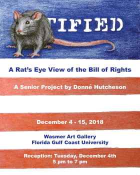
The idea for this project germinated when the results of the 2016 election revealed the deep political divide in this country. This political polarity has cost me relationships with family and friends. My pain is not unique. I know few people who have not been affected. As our shared pain explodes into anger and violence the question arises: How can we come together and heal ourselves? The answer comes down to love. In Ratified I combine the two things I love the most--my pet rats and my country-- to form images that remind us we are all Americans. In these ten paintings I visually play with words and ideas from our first ten amendments, and use rats, who could care less about any of our political issues, to present my interpretations.
When asked if I am emulating Banksy or Blek Le Rat when I paint rats, my answer is, "No". Rats have been around for a long time and have been used in artwork to convey a number of emotions: fear, disgust, alternate point of view, ambition, the list goes on. The street artist Blek Le Rat considers them a marginalized element of modern urban society, invaders that leave a huge emotional mark on the people that despise them. I tend to view rats along similar lines, but without the fear and disgust. I view them as a separate culture that interacts with human beings. My viewpoint accepts them and what they share with human beings while, at the same time, recognizing their profound differences. It is these differences that grant them the status of perfect objective observers. The coincidental similar sounds of "rat" and "right" adds a layer when I am answering "why do you paint rats?" I love puns and wordplay and I rely on homonyms to depict some amendments. Others contain too many ideas to comfortably fit in one painting, so I based my image on one well known thought. I have had to edit always bearing in mind: "This is the Bill of Rights not just pictures with rats in them."
I have chosen acrylic paint for this project for a number of reasons. First, acrylic paint is more durable than drawing mediums. Although pastels offer the same bright, vivid colors it is easier and less expensive to frame and transport acrylic paintings. Second, paint can produce a hard edge and an intensity in fields of pure color that cannot be achieved via pastel. While making political commentary I want the hardness and intensity of acrylics. Third, acrylic paint is a flexible medium. It works well with collage. Acrylic gloss or matte medium makes an excellent adhesive for attaching paper to canvas and is a superb sealer that protects the paper layers from staining by subsequent paint layers (several of the pieces in this series combine paint and paper). Acrylic paint can be thinned with mediums and worked, albeit very quickly, in multiple layers like pastels or oil paints. Acrylic paints when thinned with water can be worked like water color paints. Without thinning them, with or without the addition of a thickening agent, acrylic paints can be worked impasto with either a brush or a knife. Considering that I am referencing a variety of different ideas in separate paintings, I believe that a variety of techniques are necessary to effectively present them. To create visual unity is this series I have chosen canvasses that are all the same size, although their orientations differ. I frame each canvas identically, and, of course, each painting contains a rat. All these things and the flexibility of acrylic paint permits the necessary individuality of each piece while insuring that that entire series works as a unit.
-
Chloe Lewis HAPPY PLACE
Toggle More Info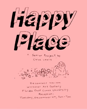
This is an interactive installation that is divided into three parts. All three parts explore different childhood memories of coloring, playing, and drawing. Part One involves a wall of coloring booklets that you can open and explore its contents. The coloring booklets are 4 pages of line drawings that relate to my childhood fascinations, like animals, people, and bugs. There are over 100 booklets all represented in vibrant hues. Part Two of the exhibition is a floor installation with a small 2’ x 2’ table with grass grown on top combined with more then 40 individual geometric forms. The forms are represented in cones, cubes, rectangular prisms, cylinders, and half spheres. The small blocks are closed forms with bits of clay that produce a sound as you handle them, this is meant to entice curiosity. Part Three is an interactive drawing wall with a small prompt for the viewer to respond to and post on the wall. This is meant to relate back to Part Two asking the viewer to draw what they believe is inside of the play blocks.
My happy place is directly related to my childhood; I discovered this while using these images of coloring, playing, and drawing to help me cope with stress and anxiety in my life. Part One, Two and Three explore different aspects of the happy places that give me comfort. Part One the coloring booklets are an outlook to represent the curious childhood experiences of the observing trees, flowers, playgrounds, people, cars, furniture, bugs, toys, animals and electronics. The coloring booklets are also meant to be an outlet for the viewer to be creative and joining in on the meditative properties of coloring. Part Two is a child-like sensory experience. The play blocks are represented in different colors as well as a variety of surface finishes. This is meant to excite one into playing with them. The pieces inside the clay are meant to make one curious and the grass is meant to be playful. Part Three expresses a small prompt for the audience to relate back to Part Two this involves asking the viewer to draw what they think is inside of the play blocks. This part of the exhibition is meant to challenge your imaginative self and make one look at the world through curious eyes. One is meant to engage with the space to embody a sense of whimsy and joy while interacting with the environment. Each part addresses a creative outlet that will implore the viewer to be creative weather that is from coloring, playing and rearranging, and drawing.
Part One of my exhibition was drawn in my sketchbook, scanned, and printed on an 8.5 x 11 sheet of cardstock. The images were drawn with gouache, graphite, and ink. The drawings were then combined into a small booklet and sown together. Part Two is made from using P-5 midrange off white clay. The shapes were formed using a plaster slump molds. The finishes on the play blocks were achieved with underglaze with Amaco clear glaze and Mayco matte clear glaze. I used underglaze colors as well as acrylic colors on a variety of forms. The grass table was constructed out of wood and contains a six-inch deep bed for the soil. The bed of the table was sealed with caulking and Flex Seal. Once the Flex Seal cured I layered in ¾ cow manure and ¼ potting soil. I speckled in the grass seed on the top layer and lightly disturbed the soil so as to bury the grass seed. They were watered daily and were open to the sun before its stay in the gallery a grow light is put up every evening to ensure it receives sun light. Part Three is made with 8.5’’ x 11’’ sheets of cardstock divided into 4 different small cards that are approximately 4’’ x 5’’. The drawing table was constructed out of wood. The prompts are mass-produced by making original drawings, scanning them and printing onto an 8.5’’ x 11’’ sheet of cardstock.
-
Tariqa Liebermann THE SPIRITUAL SPECTRUM
Toggle More Info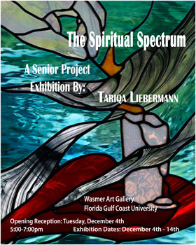
Spirituality and religion are essential parts of human existence. The spiritual essence of many religions however, has been contorted over the centuries, mired in superstitions, outdated traditions and contradictory interpretations. While people still find paths to enlightenment in religious scriptures, it is increasingly hard to follow ancient laws and traditions in an ever progressing world. As the newest independent world religion, the Bahá’í Faith strives to gives valuable insights into the way people should live their lives as just and compassionate members of a global community in the present day.
My works of art are an exploration of the Hidden Words, a small booklet written in 1857 by Bahá’u’lláh, the founder of the Bahá’í Faith. This collection of short utterances are said to be the essence of certain of spiritual truths, clothed in the garment of brevity. The mystic passages of the Hidden Words inspire the ideas behind my artwork. Each art piece is an interpretation of a Hidden Word that has had a significant impact on my life. My goal as a Bahá’í artist is to share with the viewer the beautiful writings of my Faith that are so dear to my heart. By creating stained glass pieces and drawings of these writings, I strive to serve and guide people when they are lost and contribute to making the world a kinder and more beautiful place.
The pieces exhibited are of two kind, stained glass artwork and drawings on paper. In both mediums I focus heavily on the symbolic use of color. By bringing color symbolism into my work, I aim to connect the viewers more fully to the work, creating a spiritual and emotional bond to the pieces. When creating stained glass art, I work with unique, individual pieces of colored glass, letting the patterns, textures and colors of the glass itself tell the story of the artwork for me. By allowing light in from the environment, the glass pieces are shedding literal light on the Word of God. The drawings exhibited are complementary works to the stained glass pieces. Drawn with graphite and ink washes with color added on top afterwards, the drawings are given a magical, mythical feel that plays off of the beautiful mystic utterances of the Hidden Words.
-
Brianna Linden JOURNEY INTO THE SUBLIME
Toggle More Info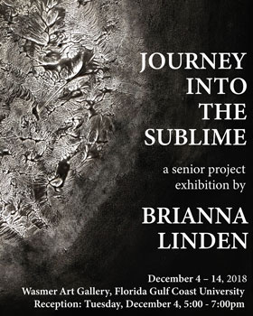
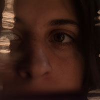
In defining the sublime, we find ourselves mulling over minimal details because the concept is an interiorized focus, challenging the traditionalist ideas of beauty. By allowing the viewer to be freed from psychological constraints, it replaces the unrealistic interpretations with a grounded reality of what is beauty in art. The sublime creates a sense of terror, not in regard of physical violence or a modern definition, but an obsession with the magnitude of beauty in one’s conscious which leads to this fascination. This reveals an instability in the modern world because of human limitations and represents these boundaries in the same way the canvas does. This restricted space to create is bound to the landscape it inhabits. This personal fear of greatness is traded with a sense of security when the person becomes fully engrossed in the realization of the unavoidable because of the sublime. As our culture strives to advance forward we lose a sense of who we are, becoming as rigid as the box we have created for ourselves. I want to bring us back to the focus on the intangible, those feelings and emotions that are lost in technology.
My series, Journey into the Sublime, demonstrates my engagement in the idea of the sublime. This revelation, with the return to traditional media, focuses on the creative process and not the technology. To realize my aspiration of translating these conflicting emotions into art involves constant spontaneity and experimentation. The ability to surprise not only the viewer, but myself, with these decisions and mistakes is how my art is created. I can only refine these thoughts and feelings into a cohesive setting for the viewer through the style of abstract expressionism. It is because of this non-representational concept that the works are usually made in self-interest, having a distinct, but not exact physical similarity to the objects in our world. This allows the viewer to draw their own interpretations of what they see and fully engage in the pieces. Transporting them from their general beliefs to a place of emotional contemplation, this space becomes their area of free thinking. I want to illicit, like that of my own experience to artist Mark Rothko’s artwork, the same feelings and emotions that engaged me in the idea of the sublime. The abstract expressionist movement allows this experimentation of form and space, a freedom from the objective reality of strict representational art.
My series of works create a cohesive atmosphere for the viewer to immerse themselves with. In my carefully controlled environment of creation I minimalize objects to the necessary basic details, combining the conceptual with a physically visual representation. I began combining strips of paper into my drawings from experimentation, inspired by Barnett Newman’s zip marks. The focus on the internal rather than the external is imperative to my process, vast forms encompass the page followed by smaller spaces invading the composition. The sculptures display this by using negative space, the curves and angles allow multiple facets to appear which produces an interior emphasis. There are contrasting values with colors and textures used to emphasize the ominous mood. This manipulation causes the viewer’s eye into believing the drawings are one because of the dividing line, but the sculptures differ because they utilize surface quality and negative space to make the same effect. The layering process contributes in the design of the visual landscape, giving the viewer a sense of place and structure without alluding to any one specific reference. This duality depicted in the visual is the direct response to the conceptual, it truly becomes one when the one viewer allows themselves to be fully encompassed by the works that it becomes sublime. It is through this movement I found myself, as an artist, able to become absorbed in the art making process to describe the intangible and connect with my audience.
-
Kevin Madieros ANAMNESIS
Toggle More Info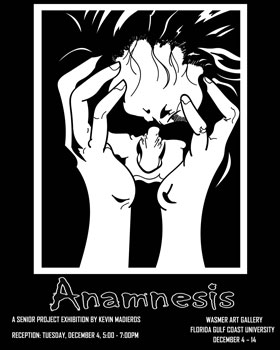

Anamnesis "a calling to mind, remembrance," is how the brain correlates when we listen to music, watch a movie or read a book and how we can reminisce in those examples. Everyone has a story, that story can be about tragic moments, such as, a loss of a loved one, problems with relationships, issues with finances, self-esteem or personal appearance, and endless other categories. Not everything in my work has to resemble the feeling of hopelessness and tragic scenery because we also have the better moments on our past that keeps us going, that keeps us motivated. My series is a collection of scenes that the viewers will reflect upon to the times in our past when we experienced both positive and negative situations in our lives.
Art allows an individual to express their history, desires and fears. It is a way to produce our most intimate and personal thoughts. As a teen I was heavily influenced by seeing artist create an image from their imagination and create it into a vision for all to witness has always been so stunning to me. To have the power and ability to have another human being be able to relate on those deep levels of fear, hope, love and destitution. Art is a fascinating way of enhancing an emotional connection. I’ve never been more satisfied with the progression of my work and how much I’ve grown over time with my art!
Being a student at FGCU I’ve continued to further my talents and expand on my own comic book style of drawing and illustrations. Now that I’m able to be free with genre in the art gallery, I plan to take advantage of the opportunity to create a powerful series. The method to my routine is that every piece is sketched out first, I finalize all my details and line work to soon be transferred digitally. My sketches are then scanned and the files are now transferred on my pc, there I start finalizing my line work and fix any flaws on adobe illustrator. On illustrator I have access to make smooth line work using my digital tablet. Once my line work and revisions is complete I switch over to Photoshop where I can illustrate and finalize my image where it’s ready to be printed and displayed!
-
Josselin Rosa BEING POSITIVE
Toggle More Info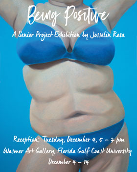
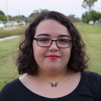
My senior project is a body of work that focuses on the idea of body image, body positivity, and its perception through the average person. Negative body image is a real problem that faces many men and women not only in the United States but also in other parts of the world, particularly in westernized countries. This problem has lead to issues with self-esteem among individuals of all ages, genders, races, etc. in America. It has come to a point where how one views their own body image becomes equivalent to their self-worth. This unhealthy type of thinking can lead to serious mental health problems in the future, including eating disorders like Anorexia Nervosa and Bulimia Nervosa.
Body image has been a recurring topic for me in my four years of college. I have explored body image in both my art as well as in formal debate. I feel very passionate about this because, personally, I have had issues with self-esteem and self-image from a very young age. I also know many other women and men that also deal with such issues. My intention is to bring confidence to those with low self-esteem or negative body image, including myself. Seeing the variety of body shapes and types would help others realize that they are not alone in the world and that their insecurities, viewed as “flaws,” should not be viewed as flaws. Everyone is unique and that should be something that is celebrated!
My Senior Project consists of a series of six pastel drawings done on 19 x 25 in. (48.26 x 60.96 cm.) Canson Mi-Teintes Pastel Paper of varying colors. The soft pastels I used were Faber-Castell Soft Pastels. To create my series, I used real people as models for my drawings. Because this is about body positivity, I made sure they were comfortable with being a model and that it was completely voluntary; models could back out at any time. I also let them choose their pose and the color of the paper for the drawing so they would be the most comfortable with themselves. I chose to not include faces in my work because I felt that it would take away from the forms, as humans are just naturally drawn to faces. Using bold colors for the paper, bright palettes, and a naturalistic style, my intention was to convey the feeling of positivity and celebration
-
Meghan Skrobis MEGABYTE
Toggle More Info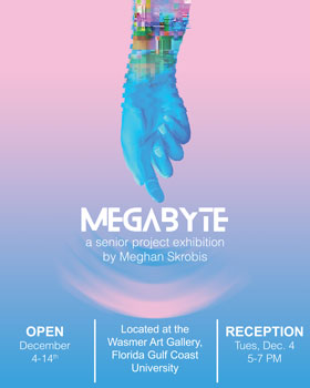

For my project, I created an electronic music producer named Megabyte, complete with a logo and branding standards. EDM (electronic dance music) has a rich history and culture, and EDM festivals are unique to any other kind of live musical performance. They involve mixed music that’s constantly changing and explosive moving visuals. I wanted to celebrate that culture by creating a soundtrack of songs I love and setting that soundtrack to visuals.
Since music was first commercialized, visual art has accompanied it. Music producers have their own brand, with a logo and album art, as well as themes and styles that they adhere to. When they perform live, moving visuals on screens behind them elevate their music and provide a unique experience for fans watching. These visuals are usually based on the themes embodied in the music of the producer. For electronic music producers, these visuals are absolutely vital. An EDM producer usually doesn’t have any classic instruments on stage, and they can’t move from their equipment. Therefore, the set visuals become the focus of the crowd, so producers work to ensure that the videos and loops are attention-catching.
I have a very deep connection to electronic music, since I’ve been listening to it while I make art for several years. My favorite type of EDM is cinematic and melodic; it feels like the soundtrack to a movie. The live sets of producers like Porter Robinson and Odesza take this type of music to another level by adding dramatic, beautiful video to the experience. Each “set” a producer makes is made up of a set of songs (usually off their newest album or release) and visuals that accompany it. A live set is a story told through music and video, and no two live sets are ever exactly the same. I created my own live set by putting together a soundtrack that told a story, and creating video to accompany the music. The theme of my set is the birth and death of a universe. The various pieces of video I constructed either feel like a world coming together, or falling apart. I used the theme to explore the concepts of virtual reality, digital glitching, and the destructive beauty of an apocalypse. I used Adobe After Effects to create the video portion of my project. AFX is a powerful software that allows a user to take a graphic and animate it, give it special effects, and set it to audio. Any type of video or still image can be manipulated in AFX. The most intense features of AFX allow a user to simulate an entire three-dimensional plane, such as a mountain range, an ocean, or space. These simulations are the basis of my project. I supplemented the simulated footage with found footage that represented ideas important to the project. Then I edited all my created video and found footage with various effects. The main style I referenced was glitch art, which is digital media that has been altered to look like it is breaking down in some way. I used a combination of inverted colors, tv “static”, and bright, sudden colors to achieve this glitching effect. I found that glitch art worked best to portray the themes like the digital apocalypse that I wanted to portray. Lastly, I edited the video so that it was 1080 x 5760, so that the video can be shown across 3 50” monitors. This way, the video best simulates the concert experience, across multiple large-scale monitors. For the album art and concept art, I used Adobe Photoshop and Adobe Illustrator, and the images I created in still form are stylistically similar to the video. The entire project is meant to be cohesive in subject matter and style, to give myself a recognizable “brand”.
-
Sara Stowers FREE FLOATING
Toggle More Info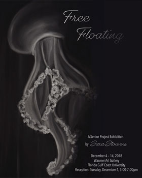
Growing up, I adored the ocean inside and out; I enjoyed going to the beach and even going to aquariums. For me the most nostalgic part of going to aquariums as a kid was stepping into the dark deep sea exhibits; I could sit in front of the jellyfish enclosure for days, watching them wash back and forth slowly drifting into one another, floating with no worry or designated path. I have always felt drawn to jellyfish since I can remember, reason why they are the focal point of my project. I extensively researched different types of jellyfish and found myself once again being pulled into the darkness of the ocean and these extraordinary creatures. When I think of jellyfish I picture the lack of physical and mental effort it takes for them to experience floating. The act of floating allows your brain to take a mental break and relax, releasing endorphins and dopamine; chemicals in your brain that make your body feel euphoric. My incentives for this project are for the viewer to get lost in the swarm of jelly fish and experience their elegance and want to float too.
Initially, I really did not understand why I always find myself doodling jelly fish besides the fact that I find them beautiful creatures. I decided to try to experience the sensations of a jellyfish to fully understand. I experimented with an empty pool that I had all to myself, meaning I was in complete solitude from the world and just float. In that moment I felt like a jellyfish, free, distressed, sailing in whichever path the pool took me effortlessly. This experience gave me the realization that I highly enjoy floating similar to a jellyfish because gives my conscious mind a break.
For this series I focused on jelly fish that live in the deepest zones of the ocean. I have concentrated on the lighting and movements of the jelly fish as well. I have created one large scale piece of a jellyfish swarm, it is 50 inches high and 8 feet long, displaying horizontally along the wall like a jellyfish aquarium. Next to the swarm is a series of smaller charcoal drawings. The pieces are of different types of jellyfish, focusing again on lighting and the movements of the jellies. My work is created using black charcoal and for the foreground I have erased the form of the jellies to incorporate chiaroscuro and white pastels as a contrast between light and dark. With the white pastels I was able to create a bolder source of light that an eraser will not be able to accomplish. I picked charcoal as a medium due to it being one of the darkest of darks to manipulate the forms of light by erasing. I decided to just use chalk based materials because I can smooth out the texture of a jellyfish and create that beautiful tonal rang, making the viewer experience that sense of serenity and peacefulness. To me the smoothing of the charcoal and white pastel emphasizes the feeling of floating and being relaxed in that therapeutic state.
-
Nicholas Tricarico LAND OF KODAMA
Toggle More Info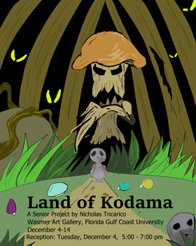

For my senior project, I’ve created many different characters for a video game of my own design. Based off Japanese forest spirits of the same name and Hayao Miyazaki’s depiction of them, these “Kodamas” have been brought to life as a group of strange, cute, and other worldly characters that will invite you to their way of living and habitual lifestyle. All the Kodamas are unique and have their own magical touch to them, and here in my project, you’ll see what they’re all like, how they live, and what sort of other dangerous creatures they may be hiding from in their deep, vast forest that they call home.
I’ve always had a passion for creating my own characters for forms of media, be it comic book characters, video game characters, or mascots. I grew up being surrounded by so many iconic figures that I wanted to be an artist like that someday. An artist who was able to create captivating icons that people would adore and remember, not unlike Mickey Mouse. Originally, the idea behind the Kodama was very much like that of other video game characters I grew to love. In the 90s, it was a common practice to take a lesser known creature and making it cute or cool and the basis of a game, such as Crash Bandicoot or Sonic the Hedgehog. In my case, I opted to use figures of Japanese folklore. Modern depictions of the creatures often take inspiration from Mr. Miyazaki’s take on them in the film Princess Mononoke. My love for the characters made me want to design my own versions of Kodamas, much like a “tribute” to his work, but with more life and emotional energy. Unlike other artist representation of them, the Kodamas of my design are more creative, and represent different emotions, such as bravery, loneliness, heroic, and depression.
Creating the Kodamas was always an old-fashioned sort of process. Pen and paper were everything I initially used to draw them at first, with them later being scanned into my computer for editing. I saw that this made them a lot easier to edit, especially when I was experimenting with the colors, while still keeping their hand drawn look to them. Seeing as how comic books and other cartoons with heavy outlines influenced my art a lot, I ended up using thick outlines for the Kodamas, making them appear like they could fit right into a picture book. They were characters I wanted to see being used in anything that could make people love them; a cartoon, a game, a web series with them and their adventures. The enemies for the game I took a different approach with. I wanted them to appear twisted and deranged, something much more frightening and unsettling to contrast with the cute Kodamas. Animism and destruction of the forests across the world were two key points of research taken into designing them. I wanted to have enemies that would represent a dying environment, ones that would look like beings that crawled out of a destroyed, toxic forest.
